
Facebook Ad Copywriting: 12 Rules (2026)
Twelve copy rules built on how Meta renders ad text in 2026: the See More cut, the 27-character feed headline, the policy lines, and how to draft variants instead of staring at a blank box.
Updated December 2026 · Xanny Lee, CEO
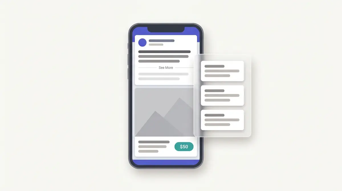
Facebook ad copy is read inside the windows Meta gives you, not the boxes you type into. On the mobile feed only about the first 125 characters of primary text show before a See More link hides the rest, the Facebook Feed headline is recommended at just 27 characters, and the link description is the least visible field, so the hook and the offer have to land first. Write to the reader in the second person, lead with one concrete benefit or a specific proof line (a brand like Berlanco saying it is stocked in 300 pharmacies beats trusted by thousands), keep claims inside Meta's Advertising Standards, then draft three to five variants and test rather than guess. Meta's built-in text generation can produce up to five variants per field, but length and angle still need testing: a controlled 2018 AdEspresso experiment found the worst copy cost 2.4 times more per lead than the best.
You have the audience, the product, and a blinking primary-text box, and the cursor just sits there. Most advice tells you to be clever, but Facebook does not reward clever. It rewards copy that survives the first cut Meta makes to it: the words that still show after a See More link swallows the rest, the headline squeezed into a caption-length slot beside a button, the claim that clears policy review without a second look. Learn the way Meta actually renders and judges your text, and the blank box stops being a creative problem and becomes a solvable one.
Why Facebook copy is a rendering problem, not a writing problem
Facebook does not store your copy the way you typed it. It renders it inside fixed windows, and most of what you write is hidden by default. The job of good copy is to win those windows.
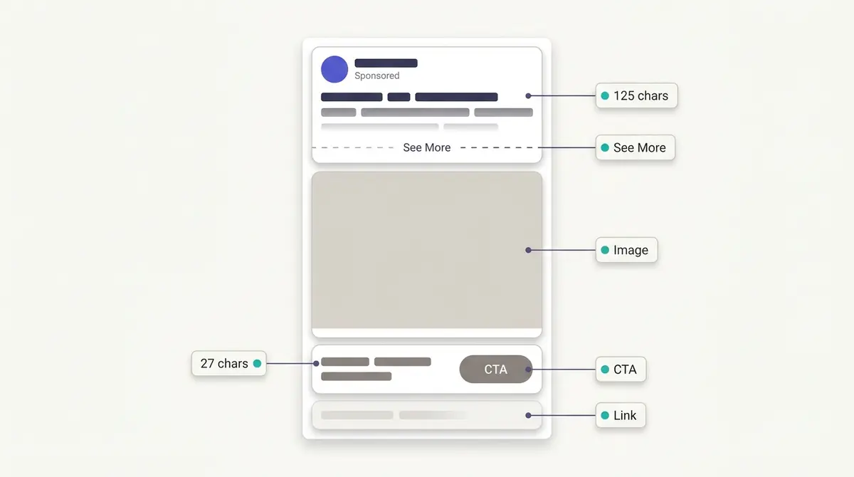
Three fields carry the text on a standard feed ad, and each behaves differently. The primary text sits above the creative and is the only field with room to breathe. The headline sits below the creative, beside the call-to-action button, and works like a short caption or offer line rather than a sentence. The link description sits under the headline, is the least visible field, and is often hidden entirely depending on placement, so nothing load-bearing should ever live there.
What makes this a rendering problem is the truncation. On the mobile feed, primary text is cut to roughly the first 125 characters before a See More link folds the rest away, and most people never tap it. Meta's own Ads Guide recommends keeping Facebook Feed primary text in a 50-150 character band, with the visible window sitting near the low end of that range. The reach at stake is enormous: DataReportal counted a potential Facebook ad audience of 2.28 billion users at the start of 2025, and almost all of them meet your ad through that 125-character slot, on a phone, mid-scroll. The rules below all flow from that single constraint.
The 12 rules, in order
The rest of this guide is twelve rules, and every one is a way to win the window Meta gives you rather than the box you type into. Here they are in the order you actually write an ad, so you can scan the set now and use the sections below for the detail.
- Write to the visible window, not the box. The See More cut near 125 characters is the real canvas.
- Lead with the reader and the outcome, not the brand. What changes for them comes first.
- Open with a hook that does one job: spark curiosity, name a pain, or promise an outcome.
- Pick a structure so the ad reads as one thought, not a pile of disconnected lines.
- Turn every feature into a benefit before it earns a place in the copy.
- Prove the claim with something specific and checkable, not an adjective.
- Put the customer's own voice in the copy wherever you can.
- Use urgency only when the deadline or the stock limit is real.
- Write the headline as a caption, around 27 characters, not a sentence.
- Match the call to action, both the button and the closing line, to what the copy promised.
- Write the way your customer talks, then read it aloud.
- Draft three to five genuinely different variants, keep every claim inside Meta's policies, and test.
Win the first line
The fastest way to waste the visible window is to talk about yourself. Brand-out copy ("We are excited to launch...") spends the 125 characters describing the company; reader-first copy spends them on what changes for the person reading. So the first rule is to write to "you", lead with the outcome, and put the benefit before the cut. Benefit-first also happens to be the most compact way to write, which is exactly why it fits the slot. Everything after See More is for the reader you have already hooked. If your opener still works as a standalone sentence with the rest of the ad deleted, you have written to the window correctly.
The second rule is what that first line should do. A strong opener is not clever for its own sake; it does one of three things: it sparks curiosity, it validates a specific pain, or it promises a specific outcome. Pick one per ad and commit. Real ad examples show the curiosity route working without a drop of polish. Fitness Achievers, a Malaysian gym brand, opens with a vernacular question, "eh, got any gym nearby ah?", which reads like a thought the scroller already had. It earns the tap because it sounds like a person, not a billboard. The lesson is not to copy the phrasing, it is the structure: a first line that feels like the reader's own question will out-pull a tagline almost every time. The opening line is enough of a craft on its own that it has its own playbook in the first line is a hook.
One discipline makes every opener better: write the way your customer actually talks, then read it aloud. The Fitness Achievers question lands because it sounds like speech, not marketing. If a line makes you wince when you say it out loud, or you would never use those words with a friend, the reader feels the same stiffness and keeps scrolling. Contractions, vernacular, and the occasional fragment are not sloppiness in feed copy; they are what makes an ad read like a person in the feed instead of a banner bolted into it.
Five openers you can keep on hand
The hook deserves more than a single principle, because most ads die in the first line. You do not need a swipe file of a hundred openers, you need a handful of patterns you can reach for and adapt. Five carry most of the weight, and each one fits inside the 125-character window.
- The question opener. Ask the exact thing the reader is already wondering. A coffee subscription might open, "Still buying the same supermarket bag you grabbed two years ago?"
- The number opener. Lead with one concrete figure that reframes the problem, but only if it is true and yours to claim. A sleep brand could open on the number of times the average person checks the clock before falling asleep, when it has the data to back it.
- The pain opener. Name the ache in the reader's own words. For a meal-kit service, "By Wednesday the dinner plan has already fallen apart."
- The disqualifier. Call out who the product is not for, which makes the right reader lean in. A premium skincare line might open, "If you want a fix by Friday, this is not it."
- The review opener. Borrow a real customer's first line and let it carry the hook. "I almost returned it on day one. I am glad I didn't" reads like a person, not a brand.
None of these is clever for its own sake; each earns the tap by sounding like the reader's own thought. Build a short, tested set you can pull from, the way a swipe file is meant to work, and adapt the pattern to your category rather than copying the line.
Pick a framework so the ad reads as one thought
A hook stops the scroll; a framework decides what the reader meets next, so the ad lands as one argument instead of four loose lines. A framework is just a running order for the same few moves: open, build interest, prove, ask. You do not need all of them. Four cover almost every Facebook ad, and the right one is whichever opening move matches what your offer leads with.
| Framework | Stands for | Lead with it when |
|---|---|---|
| AIDA | Attention, Interest, Desire, Action | The product demonstrates well and you can build from a hook to the click |
| PAS | Problem, Agitate, Solve | The reader already carries the pain and the problem line is your hook |
| BAB | Before, After, Bridge | There is a visible transformation to show, then name |
| FAB | Features, Advantages, Benefits | The product is spec-heavy and each feature needs a benefit attached |
These are lenses, not rivals, and you do not pick the smartest one, you pick the one whose opening move matches what your offer leads with. The full set of six, with worked examples and the Meta slot each fits, lives in the ad copywriting frameworks hub, and the two that earn their own deep build are PAS and AIDA.
A quieter checklist sits over whichever framework you pick: the four Cs. Clear beats clever, concise beats complete, compelling beats correct, and credible beats loud. Read a finished draft against those four words before it goes live, and cut whatever fails one of them.
The headline and description fields
The Facebook Feed headline is recommended at just 27 characters, per Meta's Ads Guide. That is not a place for a clause; it is a place for a caption. Think of it as the offer or the proof condensed to its hardest few words: a price, a guarantee, a category-defining claim. It sits next to the button, so it should read as the reason to press the button. Because it is so short, the headline is where specificity pays off most. "Free shipping over $50" beats "Great deals inside" not because it is longer but because it is concrete. Reels overlays squeeze even harder, down toward ten characters, which is why the same offer gets written differently per placement.
The link description is the opposite problem: the field marketers overthink and viewers rarely see. It is the least visible of the three, and depending on placement it can be hidden entirely, so never put anything load-bearing there. Keep it short and let it reinforce, not carry. If your offer only makes sense when the description is read, the offer is in the wrong field. Move it up into the primary text or the headline, where it will actually render.
Those windows shift by placement, and the squeeze gets tighter on Reels, Stories, and Marketplace than on the feed, which is why a line written for one slot can truncate in another. The full breakdown of what shows where lives in the guide to Meta ad copy character limits. The rule that travels across all of them is the same: put the load-bearing words first, because every placement cuts from the end.
Test copy length, do not assume short wins
"Keep it short" is the most repeated and least reliable rule in Facebook copywriting. Length is a test variable, not a law. The cleanest illustration is still a controlled 2018 AdEspresso experiment that pitted short, medium, and long copy against each other for a considered offer: mid-to-long copy won on cost per lead, and the worst-performing version cost 2.4 times more per lead than the best. The same experiment is a humility lesson too, because 89% of the marketers polled beforehand had voted for the three versions that went on to perform the worst.
The takeaway is not "long copy wins". It is "your instinct about length is probably wrong, so test it". Match the length to how much convincing the purchase needs: an impulse buy or a familiar brand can win on one tight line, while a higher-priced or unfamiliar offer may need room to handle objections. Then run both and let the numbers decide, the way you would in any structured A/B test or wider creative testing routine.
Turn every feature into a benefit
The most common reason good copy falls flat is that it lists what the product is instead of what changes for the reader. A feature is a fact about the product; a benefit is the thing the reader actually wants. The reader will not do that translation for you mid-scroll, so you do it for them.
Take a stainless-steel water bottle. The feature-led version reads like a spec sheet:
Double-walled vacuum insulation. 18/8 stainless steel. Leakproof lid.
Every word is true and none of it sells. The benefit-led rewrite cashes each feature out into something the reader can feel:
Your coffee is still hot at 3pm and your bag stays dry on the commute, because the seal does not leak and the steel holds temperature for hours.
Same product, same facts, but the second version names the payoff. A quick test catches the lazy lines: read each one and ask "so what?" If the feature has no answer, cut it or finish the sentence. "Holds temperature for hours" earns its place only as "your coffee is still hot at 3pm." Lead with the benefit, and keep the feature as the reason the benefit is believable. That feature-to-benefit hinge is the engine inside the FAB framework, and the ad copywriting frameworks hub builds it out in full.
Lead with specific proof, and write inside Meta's policies
Vague superlatives ("best ever", "trusted by thousands") are cheap to write and easy to ignore. A specific, named result does the persuading and, on regulated categories, keeps you compliant. Berlanco, a Malaysian skincare brand, can say it has been around for a decade and is stocked in 300 pharmacies, which is a concrete, checkable proof line that beats "trusted by thousands" outright. It also sidesteps a policy trap, because it talks about the brand's footprint rather than making a claim about the viewer's skin. Specific offers travel through the See More cut better than adjectives do, because a number is short. Glad2Glow, another real skincare brand, can open on its five-piece bundle at RM58.50, a single concrete figure that lands inside the visible window and tells the reader exactly what they get. The discipline is the same whether your proof is a pharmacy count, a bundle price, or a review volume: name the thing, do not describe it.
Footprint proof is one kind of evidence; the customer's own voice is the other, and in many categories it persuades hardest. A review count, a star rating stated plainly, or a short pull-quote from a real testimonial carries credibility that brand copy cannot, because it comes from someone with nothing to sell. A first-person line lifted from an actual review ("I stopped reapplying at lunch") works as proof and as a hook at once. Two rules keep it clean: use real customer language, never words you put in their mouth, and hold the quoted claim to the same policies your own copy follows, so a testimonial cannot promise an outcome the brand could not state itself. The forms social proof takes, and how to write each one, are covered in the guide to social proof in ads.
That discipline is also what keeps you compliant, because policy is not a final-step checkbox; it shapes the sentence. Meta's Advertising Standards govern copy, and two categories trip up otherwise good lines. Under Fraud, Scams and Deceptive Practices, you cannot make misleading or exaggerated outcome claims, so "lose 10kg in a week" is out. Under Privacy Violations and Personal Attributes, copy must not assert or imply a viewer's personal attributes, including their health, age, or financial status. That is why a line like "Struggling with your adult acne?" aimed straight at the reader is risky: it implies you know something personal about them. The fix is usually a reframe, not a softer claim. Talk about the product or the general problem rather than pointing at the viewer: "A gentle routine for breakout-prone skin" carries the same intent without the personal assertion. Health-and-wellness copy gets an extra layer of care, because it cannot generate negative self-perception, and before-and-after framing for weight loss and anti-aging is restricted. That last point is why before-and-after is best understood as a creative format, not a copy promise. Shakura, a real skincare brand, runs a before-and-after dark-spots angle in its creative, which makes the visual format clear, but the safe path is to let the image do the comparison within Meta's rules rather than writing a literal "erases your spots" line into the copy.
Urgency and scarcity, without faking it
A real deadline or a real limit moves people, because a reason to act now beats a reason to act eventually. Urgency in copy is simple: name the thing that ends and when. "20% off your first order, through Sunday" or "the restock is 40 units, then it is gone for the season" each give the reader a reason to stop deliberating. The headline is often the best place for it, because urgency condensed to a few words is exactly what that short slot beside the button is for.
The discipline is the one that runs through every rule here: it has to be true. A countdown that resets on every page load, an "only 3 left" that is never not three, or a "sale ends tonight" that runs all month is false scarcity, and it quietly erodes the trust the rest of your copy is working to build. It can also drift into the misleading-claims territory Meta's Advertising Standards prohibit. So use urgency when the deadline or the stock limit is genuine, and skip it when it is not. A brand that only ever shouts "last chance" has trained its audience to ignore the words; a brand that uses a real deadline sparingly gets believed when it does.
Buttons, placement, emojis, and layout
The call-to-action button is selectable per objective (Shop Now, Learn More, Sign Up, Subscribe, Get Offer, and so on), and Meta expects the button, the copy, and the offer to agree. A Learn More button over hard-sell purchase copy creates a small friction the reader feels, and a mismatched CTA can drag on both delivery relevance and conversion. So choose the button that names the next action the copy just promised. If the headline says "Free shipping over $50", the button should say Shop Now, not Sign Up.
The button is not the only call to action in the ad, though. The most persuasive ask often lives inside the primary text, as the closing line that tells the reader exactly what to do and what they get for doing it. "Shop now and take 20% off your first order" does more work than the fixed Shop Now button alone, because it pairs the action with its reason. Think of it as two calls to action that have to agree: the button names the action from a fixed menu, and the last line of copy gives that action a motive. Which button to pick is its own decision, covered in the guide to the Facebook ad call-to-action button.
Placement matters just as much as the button. The same offer is written differently across a feed static, a video, and a Reel. A feed static leans on primary text plus the headline, so the words carry the weight. A video or Reel hook lives in the first seconds and the on-screen text, so the spoken or captioned opener matters more than the primary text field. Reusing one block of copy across every placement wastes the format: write the feed version to the 125-character window, and write the video version to the first three seconds, because the reader meets the message in a different order each time.
Emojis and line breaks belong in the same toolkit, because they are layout controls for the visible preview, not decoration. A line break can push a key phrase above the See More cut or pull supporting detail below it, and one well-placed emoji can anchor the eye on the offer. Used sparingly, they shape what shows in those first 125 characters. Used heavily, they read as clutter and can drift toward the engagement-bait styling Meta's systems discount. One or two, with intent, in service of the layout.
Draft variants and sequence them into one ad
Meta lets you add up to five variations per text field, primary text and headline, in a single ad, and its built-in text generation can produce up to five variants per field on its own, tailored to a brand tone or audience and even translated. According to Jon Loomer Digital's 2026 write-up of Meta's copy tooling, that generator is a useful draft engine, corroborating Meta's own About text generation documentation.
Treat AI text as a first draft, not a final answer. The caution worth knowing: Advantage+ creative can rewrite your tested copy at delivery through its text-variations feature, which is great for breadth but a problem when brand voice or compliance copy must stay exact, so toggle it off at the ad level when precision matters. The point of writing several variants is not volume for its own sake; it is to give Meta genuinely different angles to test.
| Text field | Meta-recommended length (Facebook Feed) | Job |
|---|---|---|
| Primary text | 50-150 chars (~125 visible before See More) | Hook plus benefit; the only field with room to breathe |
| Headline | 27 chars | Offer or proof condensed; sits beside the CTA button |
| Link description | Short (least visible, often hidden) | Reinforce only; never load-bearing |
Variants are ingredients; a structure is the recipe. A proven sequence keeps the visible window working hard: open on the hook, state the specific benefit or proof, name the offer, then point the CTA at the next step. That is the bones of a proven copy structure (AIDA), and it is what turns isolated rules into a single ad that reads as one thought.
The benchmark that tells you whether the structure is working is click-through rate. WordStream's 2025 Facebook benchmarks put the average CTR for traffic-objective ads at 1.71%, at an average cost per click of $0.70, with shopping, collectibles and gifts leading all industries at a 4.13% CTR. If your copy sits well below your own vertical's norm, the words are not earning the click, which is the clearest signal to rewrite the opener. Conversion-side, the same source pegs the average leads-campaign conversion rate at 7.72% and the average cost per lead at $27.66, a reminder that copy that wins the click still has to carry its weight after it.
A blank-box workflow that beats inspiration
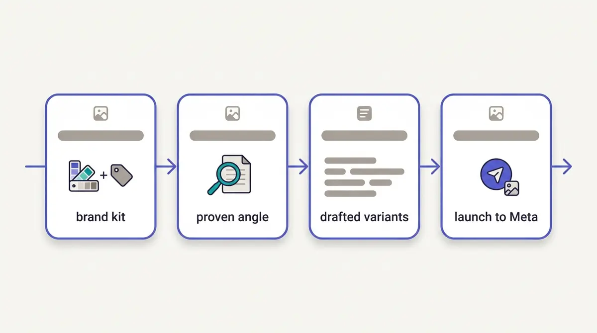
Inspiration is unreliable; a workflow is not. The advertisers who never stall at the blank box do the same four things every time. They start from a brand kit (voice, claims, the offer, the proof), so every line already sounds like one brand. They begin from a proven angle rather than a cold idea, which is what swipe-file research in the Meta Ad Library is for: read real copy that is already running in your category. They draft three to five primary-text and headline variants against the rules above, not one precious version. Then they launch and let the platform rotate, reading the winners back into the next round.
That loop, from a proven angle to drafted variants to launched copy, is the whole job, and keeping it in one place is where a tool earns its keep. A platform like AdPlay.ai grounds the copy in your brand kit and a real winning angle, then takes the finished ad straight to Meta, so the path from insight to live campaign does not break across four tabs. The blank box was never a creativity problem. It was a missing process, and the rules above are that process.
By the numbers
Frequently asked questions
How many characters should a Facebook ad be in 2026?
There is no single right length, but there are visible windows. Meta recommends roughly 50-150 characters of primary text for the Facebook Feed, with about the first 125 showing on mobile before a See More link truncates the rest, so the hook must land inside that window. The Facebook Feed headline is recommended at 27 characters, and the link description should stay short because it is the least-visible field. Past those windows, copy length is a test variable, not a rule: write what the purchase needs, then test it.
Where does Facebook cut off ad text with See More?
On the mobile feed, primary text is truncated to roughly the first 125 characters, after which a See More link hides the remainder until the viewer taps it. That cut is the single hardest constraint on Facebook copy, because most people never tap. Treat the first line as the whole ad for planning purposes: put the benefit, the specific proof, or the offer before the cut, and let everything after See More support the reader who is already interested.
Should Facebook ad copy be short or long?
Match length to how much convincing the purchase needs, then test. An impulse product or a familiar offer often wins on one tight line; a considered or higher-priced offer may need longer copy that handles objections. A controlled 2018 AdEspresso experiment found mid-to-long copy won on cost per lead for a B2B offer, and the worst-performing version cost 2.4 times more per lead than the best, so the safe rule is to test length as a variable rather than assume short always wins.
How do I write a good first line for a Facebook ad?
A strong opener does one of three jobs: it sparks curiosity, validates a specific pain, or promises a specific outcome. It is not clever for its own sake. Lead with what changes for the reader, write in the second person, and put a concrete detail (a number, a named result, a real scenario) before the See More cut. Avoid framing that asserts the viewer's personal attributes, like aiming a health or financial assumption directly at them, because that reads worse and risks Meta's policy review.
Is the Facebook 20% text rule still a thing?
No. Meta removed the rule that rejected or penalized image ads for covering more than 20% of the image in text, and it retired the old Text Overlay tool that checked for it. You will not get an ad rejected today for a text-heavy image on that basis. That said, lighter text on the creative still tends to perform better, so treat low text-on-image as a guideline that helps results, not a gate you have to clear.
Can I let Meta AI write my Facebook ad copy, and should I?
Meta's built-in text generation in Ads Manager can produce up to five variants per text field, tailor them to a brand tone or audience, and translate them, which is useful for breaking a blank page or stress-testing angles. Use it as a draft engine, not an autopilot. Read every line against your brand voice and Meta's Advertising Standards, and note that Advantage+ creative can also rewrite your tested copy at delivery through its text-variations feature, which you can toggle off at the ad level when brand voice or compliance copy has to stay exact.
What words or claims get a Facebook ad rejected?
Copy is governed by Meta's Advertising Standards. The common triggers are misleading or exaggerated outcome claims, which fall under Fraud, Scams and Deceptive Practices, and copy that asserts or implies a viewer's personal attributes, like their health, age, or financial status, under Privacy Violations and Personal Attributes. So a line like Struggling with your adult acne? aimed at the viewer is risky framing. Health-and-wellness copy also cannot generate negative self-perception, and side-by-side before-and-after framing for weight loss and anti-aging is restricted.
What are the best copywriting frameworks for Facebook ads (AIDA vs PAS)?
There is no single best framework, only the one whose opening move matches your offer. AIDA (Attention, Interest, Desire, Action) suits a product that demonstrates well and builds from a hook to the click. PAS (Problem, Agitate, Solve) is the sharpest opener in the feed when the reader already feels the pain, because the problem line doubles as the hook. BAB (Before, After, Bridge) fits a visible transformation you can show then name, and FAB (Features, Advantages, Benefits) is for spec-heavy products where each feature needs translating into a benefit. They are lenses, not rivals: pick the one whose first move matches what your offer leads with, then test it against a second.
Sources
- 1.Meta Ads Guide, Facebook Feed image ad (traffic/link clicks) specs (2026)
- 2.Meta Business Help Center, Creative best practices for text in ads (2026)
- 3.Meta Business Help Center, About text generation in Meta Ads Manager (2026)
- 4.Meta Transparency Center, Introduction to the Advertising Standards (2026)
- 5.Meta Transparency Center, Privacy Violations and Personal Attributes (2026)
- 6.WordStream, Facebook Ads Benchmarks 2025 (updated Sept 15, 2025) (2025)
- 7.DataReportal, Essential Facebook Stats (updated March 12, 2025) (2025)
- 8.AdEspresso / Hootsuite, Facebook Ad Copy Length Experiment (Aug 2, 2018) (2018)
- 9.Jon Loomer Digital, The Evolution of Meta Ads Copy and Creative Control (2026)
Keep exploring
Turn ad research into winning ads
Research the ads that work, generate the creative on-brand, and launch to Meta, all in one tool.
7-day free trial · No credit card required