
Facebook Ad Headlines: How to Write Them (2026)
How to write the 40-character Facebook ad headline so it stands alone on mobile: recommended limits per placement, benefit vs curiosity formulas, and what to test.
Updated August 2026 · Likit Sae Lee, CTO

The Facebook ad headline is a separate field with a 40-character soft ceiling, and on mobile it has to carry the offer by itself. The link description that sits beside it renders reliably in only a handful of placements (Marketplace, Search, In-Stream, Audience Network) and is hidden on the Feed and in Reels, so whatever you parked there is invisible to the 98.5% of users on a phone, per Shopify citing Statista. Sprout Social recommends roughly 25 to 27 characters for the Feed headline and 40 for Stories, which means you should write one tight line that names the result or earns the tap, then test benefit against curiosity against a real CTR bar (WordStream puts Traffic campaigns at 1.71% CTR and $0.70 CPC across industries in 2025).
You have 40 characters, a button beside them, and a description field most of your audience will never see. The headline is the smallest text box in Meta Ads Manager and the one people argue about least, which is exactly why it underperforms. On a phone it does not sit politely under a paragraph of context: the paragraph gets cut, the description disappears, and the headline is left standing next to the call-to-action button doing the entire job of telling someone why to tap. Treat it as a self-contained line, write it to the placement it will actually live in, and you turn a throwaway field into the part of the ad that moves clicks.
The headline is a separate field, and most people never see its neighbour
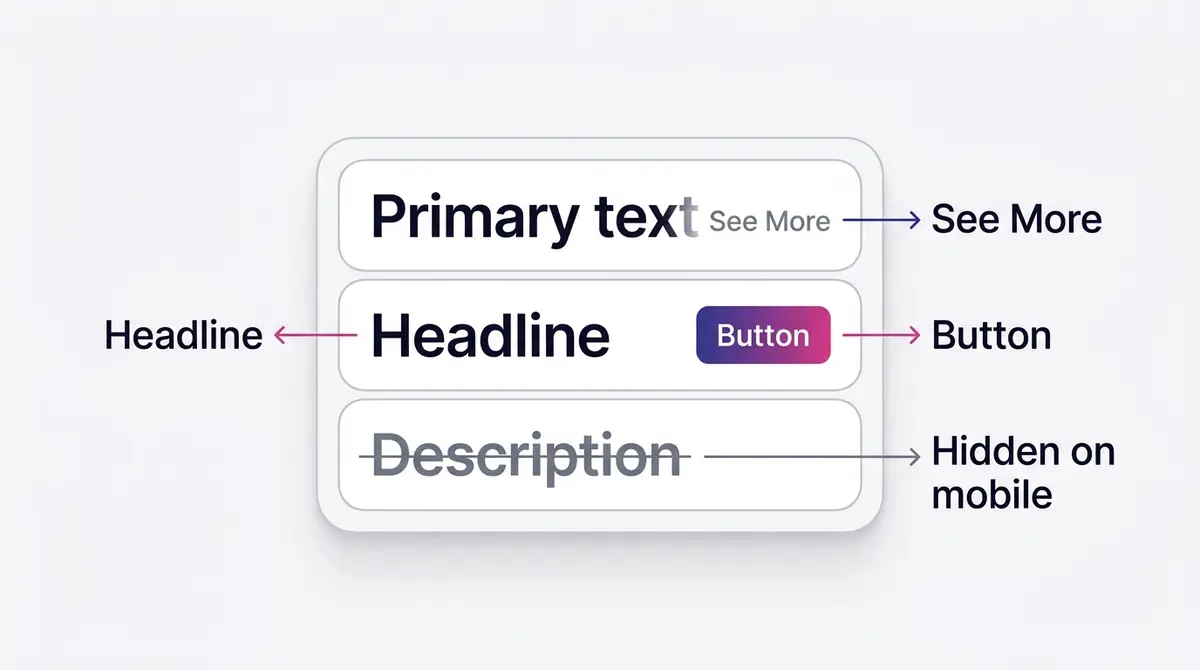
Open Meta Ads Manager and the ad creative breaks into three text fields: primary text, headline, and description. They look like a stack of related boxes, so it is tempting to write them as one continuous thought, with the headline picking up where the primary text left off and the description finishing the idea. On a desktop preview that reads fine. On a phone it falls apart.
The reason is visibility, not wording. Primary text gets cut by a See More link at roughly 125 characters on the mobile Feed. The description, the line that sits under the headline, renders reliably in only a handful of placements. Meta's own Ads Guide shows the description for Marketplace, Search, In-Stream video, and Audience Network, and leaves it off the Feed. On the Feed, in Reels, and in Stories, the description does not appear at all. So if you wrote a clever two-part idea and parked the second half in the description, half of it is gone for almost everyone who scrolls past.
And almost everyone is on a phone. Shopify, citing Statista, reports that 98.5% of Facebook users access the platform on a mobile device, and 81.8% are mobile-only. The desktop preview where your description shows neatly is a minority case. The headline, capped near 40 characters by Meta's recommended ceiling per Sprout Social's 2025 spec roundup, is frequently the only piece of context that survives next to the call-to-action button. That is the whole argument for treating it as a stand-alone line: not style, but the mechanics of where it renders.
One more mechanic raises the stakes. Long primary text gets a See more link at roughly 125 characters, so a reader can tap to read the rest. The headline gets no such rescue: when it runs past what the placement shows, the line is cut with an ellipsis and there is no expander, no way to reveal what came after. A clipped headline is gone, not hidden, so the first characters cannot be a warm-up. The headline's most prominent home is the Facebook feed and the desktop right column. It renders on the Instagram feed too, beside the button, but with less room and less weight, where the visual and the primary text carry more of the message. Write the line for the surface that leans on it hardest, the feed, and it travels everywhere else.
Recommended headline length by placement
There is one field, but it does not behave the same everywhere. The number that matters is not the 40-character maximum, it is how much of those 40 characters actually shows before the placement wraps, clips, or buries the line. Sprout Social's neutral 2025 spec list gives the two anchor points directly: roughly 25 characters for the Facebook Feed headline, and up to 40 for Stories. The rest of the per-placement working numbers are widely cited rules of thumb across spec roundups rather than figures from a single neutral study, so treat them as guidance to test against, not hard caps.
| Placement | Recommended headline length | Why it differs |
|---|---|---|
| Facebook Feed | ~25-27 characters | Wraps and truncates first on mobile; the line sits beside the button with little room. |
| Instagram Feed | ~25-40 characters | Similar to the Facebook Feed; shorter renders cleaner on smaller phones. |
| Stories / Reels | up to 40 characters, overlay a few words | Shown as a short overlay, not a paragraph; only a few words read before the safe zone. |
| Carousel | ~45 characters per card | A little more room per card, but each card competes for the same glance. |
| Right Column (desktop) | headline-only, no description | Tiny placement; the headline is essentially the entire ad. |
The practical instruction is to write the headline so its core meaning is intact at 25 characters or fewer. If the offer still lands when only the first 25 characters show, every placement is covered. If it needs all 40, you have written for Stories and broken the Feed. The Right Column placement makes the point bluntly: it is headline-only, with no description and no room, so a headline that cannot stand alone has nowhere to hide there.
The character count is also not a clean letter count. Spaces, punctuation, and wide capital letters all eat room differently, and an emoji can consume the space of several characters while rendering as one glyph. A headline that reads as 24 characters in your editor can wrap on a narrow phone because rendered width, not literal count, decides where the line breaks. Preview the ad on an actual mobile placement in Ads Manager before you trust the number; the desktop composer is the one screen that will lie about how the line fits.
Reels and Stories deserve a separate note because the headline does not render as a line of body text at all. It appears as a short overlay, competing with the creative, the safe zone, and the on-screen elements. Meta's own creative guidance is to keep text minimal in vertical placements. In practice that means two or three words of meaningful text, with the full offer carried inside the video or image rather than in the field. This is also the moment to be deliberate about placements. When you let one ad run across Feed, Reels, and Stories under Advantage+ placements, the same 40-character headline has to survive all three environments at once. If a line only works at full length, the cleanest fix is often to split the ad so the Feed version and the Reels version carry headlines built for their own limits.
Two formulas: benefit-led and curiosity-led
Once the length is right, the headline does one of two jobs. It either states the payoff plainly, or it withholds the payoff to earn the tap. Both are legitimate, and the choice is not a matter of taste, it is a test you run against your own click-through rate.
A benefit-led headline names the outcome in the fewest words that still feel specific. It works best on warm audiences and high-intent traffic, where the reader already understands the category and just needs to know what they get. A brand like Shakura runs a before-and-after angle for pigmentation, and the benefit version of that headline carries the result and the offer together: something like dark spots faded, RM68 for 2 sessions. That fits inside the tight Feed limit and, crucially, makes complete sense with the description hidden. The reader does not need a second line.
A curiosity-led headline withholds the answer. It works best on cold traffic that has no reason to stop unless something nags at them. A brand like Medicube leans on the K-beauty step no one mentioned as a curiosity angle: it implies there is a thing you are missing and does not tell you what it is until you tap. The risk is the well-known one with curiosity: if the click does not pay off, you bought attention and lost trust, and your cost per click rises as people learn to ignore the pattern.
There is a third, quieter pattern that often beats both: the proof-led headline, where the line is just a credible number. A brand like Beyond Collagen+ can state three million bottles sold and let the figure do the persuading, no adjective required. Social proof compresses well, which is exactly what a 40-character field rewards. The formula to remember is that benefit answers what do I get, curiosity answers what am I missing, and proof answers why should I believe you, and each one has to land complete inside 40 characters because the supporting fields will not be there to rescue it.
A few rules sharpen all three. Lead with the noun that matters, not a warm-up word: free same-day delivery beats get free same-day delivery, because the first characters carry the most weight on a placement that may only show a fraction of the line. Use a specific number over a vague intensifier, since 68% fewer breakouts reads as a measured claim while amazing results reads as filler. And resist repeating the brand name when it already sits in the page byline above the creative; those characters are better spent on the offer. The headline is not where you introduce yourself, it is where you give the reader a reason to act, so every character should be doing persuasion rather than logistics.
One more discipline ties the three formulas together: the headline has to agree with the creative and the hook above it. A curiosity headline over an image that already gives away the answer wastes the curiosity, and a benefit headline that promises an outcome the creative does not visibly support reads as a bait. The fields are separate in Ads Manager, but the viewer reads them as one message in a single glance, so the headline should resolve the tension the hook opens, not contradict it. For the opening-line psychology that sets up that tension, the Facebook ad hooks guide covers the primary-text side of the same handoff.
A headline formula library you can copy
Benefit, curiosity, and proof are the three jobs, but they are not the only shapes a headline can take. When the blank field stalls you, it helps to have patterns you can fill in and tighten. Each line below fits the Feed window with room to spare, which is the point: the formula handles the structure so you spend your characters on the specifics. Swap the brackets for your own offer, then cut until the meaning survives at 25 characters.
| Formula | When to use | Fill-in template | Example | Chars |
|---|---|---|---|---|
| Benefit | Warm or high-intent traffic | Result in timeframe | Whiter teeth in 14 days | 23 |
| Curiosity | Cold traffic that needs a reason to stop | The thing no one mentions | The step no one mentions | 24 |
| Proof | When credibility is what sells | Number proof noun | 3 million bottles sold | 22 |
| Offer with deadline | Retargeting and sale windows | Discount ends day | 30% off ends Sunday | 19 |
| Question | Problem-aware cold traffic | Nagging problem? | Still scrubbing burnt pans? | 27 |
| How to without | When a known pain blocks the buy | Outcome without pain | Clear skin without the wait | 27 |
| Negation or stop | A pattern interrupt | Stop common mistake | Stop overpaying for ink | 23 |
| Comparison | Switching from a known alternative | Old way vs new way | Drops vs the daily pill | 23 |
| Disqualifier | Filtering for the right buyer | Only for specific audience | Only for oily skin types | 24 |
Two of these need a warning. The question pattern is the easiest to get wrong, because a reader who can silently answer "no" just scrolls on, and you have spent the headline asking permission instead of giving a reason. "Want better skin?" invites a shrug. "Still scrubbing burnt pans?" works because almost everyone in the target answers "yes" in their head and leans in. Only ask a question your audience cannot comfortably wave away. The disqualifier looks like it shrinks your audience, and it does, on purpose: naming who the product is for makes the right person feel seen and filters out the clicks you would otherwise pay for and waste. For a deeper bench of message structures that feed the headline and the body together, the copywriting frameworks for ads guide runs through the named formulas in full.
Weak headlines, trimmed: a before and after gallery
Principles are easy to nod at and hard to apply, so here is the editing move itself. Each line on the left is the kind of headline that gets written on autopilot: too long for the Feed window, padded with warm-up words, or leaning on a verb the button already owns. Each line on the right is the same idea cut to fit and pointed at the offer. Watch the character count fall, and watch the meaning sharpen as the line gets shorter.
| Before (chars) | Why it fails | After (chars) |
|---|---|---|
| Get your free same-day delivery on all orders today (51) | Buries the offer behind "get your" and runs far past the Feed window | Free same-day delivery (22) |
| We have the best coffee beans you will ever taste (49) | A claim with no specific, and "we have" wastes the front of the line | Beans roasted this week (23) |
| Struggling to lose weight? (26) | Asserts a personal attribute, a common review trigger | A 14-day reset meal plan (24) |
| Click here to learn more about our services (43) | Repeats the call-to-action button and says nothing about the offer | Free quotes in 60 seconds (25) |
| AMAZING DEAL!!! 50% off everything (34 plus 2 emojis) | All-caps and stacked punctuation read as noise and risk rejection | 50% off everything (18) |
| Our new premium collagen supplement is now available (52) | An announcement, not a reason to tap | 3 million bottles sold (22) |
The pattern across every row is the same: lead with the noun that carries the offer, delete the warm-up, trade an intensifier for a specific, and let the button own the verb. The "struggling to lose weight" rewrite does double duty, because phrasing the benefit as a statement about the product rather than an assumption about the reader is also how you clear review. For the exact field-by-field limits behind these counts, the Meta ad copy character limits guide has the full table.
Headline or first line of primary text: divide the message
On a phone, two pieces of your copy survive: the headline beside the button, and the first line or so of primary text before the See more cut at roughly 125 characters. Everything else is either hidden (the description) or one tap away (the rest of the primary text). The mistake is to let those two survivors say the same thing. When the primary text opens with "Free same-day delivery on every order" and the headline also reads "Free same-day delivery," you have spent both visible slots on one idea and wasted the second.
Give them different jobs. Let the primary text open the loop and the headline close it: the first line earns the stop with the hook or the relatable problem, and the headline delivers the concrete payoff beside the button. Primary text: "I scrubbed baked-on grease for years before someone showed me this." Headline: "Lifts baked-on grease in 60 seconds." Two surviving elements, two distinct beats, no repetition. It works in reverse when the offer is the hook: lead with the story or the proof and put the hard number in the headline. The rule is not which order, it is no duplication, so read the two back to back as a viewer sees them, and if they are interchangeable, rewrite one. The Facebook ad copywriting guide covers how to write that opening primary-text line.
Emoji, case, and punctuation in the headline field
A few formatting decisions come up every time you write the field, so settle them once.
Emoji render, but they are expensive: one glyph can eat the width of two or three characters, so in a window where only about 25 show, a single icon can be the reason your last word wraps out of view. At most one, only where it reinforces the offer (a checkmark before a guarantee, an arrow pointing at the deal), never as decoration, which reads as noise and trips the review filters for sensational formatting.
Case has a real effect on legibility. Sentence case, capitalizing only the first word and proper nouns, reads as a person talking and feels native in the feed. Title Case reads as a banner, which can suit a formal offer but often feels like an ad, the thing the scroller is trying to skip. ALL CAPS is the one to avoid: it is harder to read at a glance, wider letters eat your window, and stacked with punctuation it draws review scrutiny. When in doubt, use sentence case and let one capitalized proper noun or a number do the standing out. Punctuation should earn its place too: a question mark is fine when the line is genuinely a question, but exclamation marks, stacked symbols, and gimmick characters do not raise click-through rate and push the line toward those same triggers.
One myth gets tangled up with headline length and is worth clearing: the old rule that throttled an image's reach when text covered more than 20% of it is gone. Meta removed that penalty in September 2020, per Social Media Today, and it never governed the headline anyway, which is a separate text box, not pixels on the image. Heavy text on the creative still tends to underperform, so keep it deliberate, but nothing beyond the placement's display window is enforced on the headline's length. The field is not always mandatory, depending on format and objective, so you can publish without one; leaving it blank just hands away the line of persuasion sitting right next to the button. Fill it, almost always, and fill it with the offer.
What a tested headline actually competes against
It helps to know the bar, because a headline test is only meaningful against a benchmark. WordStream's 2025 Facebook Ads benchmarks put the average click-through rate for Traffic campaigns at 1.71% across all industries, at an average cost per click of $0.70. For Leads campaigns the averages are 2.59% CTR and $1.92 CPC. Databox's independent benchmark across roughly 1,250 companies puts the median Facebook CTR at 1.54%, a useful second reference point because it is a median rather than a mean and is less skewed by outliers.
Do not treat any of these as a target your headline must hit. They are category-blind averages, and the spread by industry is enormous. WordStream's own Traffic data ranges from Shopping, Collectibles and Gifts at 4.13% CTR down to Auto Repair and Services at 0.80%. Quoting a flat 1.71% to a collectibles brand sets the bar far too low, and quoting it to an auto-repair shop sets it impossibly high. The right read is relative: a tested headline should beat your own current control, on your own audience, by a margin that survives a few days of delivery, not match a number from a chart.
| Campaign objective | Average CTR | Average CPC |
|---|---|---|
| Traffic (all industries) | 1.71% | $0.70 |
| Leads (all industries) | 2.59% | $1.92 |
| Median across ~1,250 companies (objective-blind) | 1.54% | not reported |
Why does the headline move this number at all, given how small it is? Because on the placement that matters most, the mobile Feed, the headline is one of the few pieces of text that consistently renders, sitting right next to the button at the moment of decision. DataReportal pegged Facebook's potential ad reach in early 2025 at 2.28 billion people, 27.9% of the world's population. At that scale, a headline that renders in full and says one clear thing is not a rounding error, it is the difference between a tap and a scroll repeated across millions of impressions.
Common headline mistakes that cost clicks
Most weak headlines fail in one of a few predictable ways, and all of them trace back to ignoring how the field renders.
The first is writing the headline as a continuation of the primary text. It reads as a sentence fragment with no subject, makes no sense on its own, and dies the moment the primary text is cut by See More. The fix is to read the headline in isolation and ask whether it still means something. If it does not, rewrite it.
The second is hiding the offer in the description. Advertisers put the price, the discount, or the deadline in the description field because there is more room, then wonder why the urgency never landed. On the Feed and in Reels that line does not exist. Move anything load-bearing into the headline or the creative.
The third is over-stuffing to fit. When the message is too long for 25 characters, the temptation is to cram it with abbreviations, symbols, and all-caps until it technically fits. That reads as noise, and it flirts with rejection, since headlines that assert personal attributes or lean on sensational punctuation are exactly what review flags. The cleaner move is to cut the idea down to one claim, not to compress two claims into a mess.
The fourth is testing the wrong thing. Changing a headline from one curiosity line to a slightly different curiosity line teaches you almost nothing. Test across the real dimension: benefit versus curiosity, plain number versus claim, offer-in-headline versus offer-in-creative. Variation has to be meaningful for the result to be.
The fifth is matching the headline to the wrong stage of intent. A hard offer line, with a price and a deadline, lands well on a warm retargeting audience but feels pushy in front of cold traffic that has never heard of you. The same headline can be a winner and a loser depending only on who sees it, so a line you killed on a prospecting campaign is worth retesting on a retargeting one before you retire it. The field is small, but the context around it is doing as much work as the words.
How the headline works with the call-to-action button
The headline never appears alone. It sits directly beside the call-to-action button, the small Shop Now or Learn More label Meta renders from your selected button type. Those two elements read as a pair, and the best headlines are written with the button in mind rather than around it. If the button already says Shop Now, the headline does not need to say shop now too; it is free to spend its 40 characters on the reason to shop. The redundancy trap is common: a headline that repeats the button verb wastes the one part of the ad where you control the wording entirely.
The cleaner pattern is division of labour. Let the button carry the action and the headline carry the justification. Button says Get Offer, headline says 30% off ends Sunday. Button says Learn More, headline says the resurfacing serum without the downtime. The viewer's eye lands on the creative, drops to the headline for the why, and finishes on the button for the how, all in one glance. A headline that fights the button for the same job, or promises browsing when the button promises buying, adds friction at the exact moment you want none. For which button to pair with which message, the Facebook ad CTA button guide covers the selection itself.
Give the ad several headlines and customize them by placement
The Feed-versus-Reels length conflict has a cleaner fix than building a separate ad for each. Meta's standard ad creation lets you supply more than one headline in a single ad: you can add up to five headline options, alongside multiple primary-text and description options, and the system rotates and tests the combinations, serving each person the line most likely to drive your result, per Meta's Business Help Center. The headline becomes a small test running inside the live ad. The catch is that any headline can pair with any opener and image, so each line has to make sense on its own, or it reads as a non sequitur half the time it shows.
When one placement simply needs a shorter line than another, placement asset customization is the precise lever. Inside one ad, it lets you set a different headline (and primary text, media, and call-to-action) per placement, so the Feed gets its tight 25-character line and Stories gets a line built for the overlay, without duplicating the ad or splitting your metrics. It is the native answer to "the same 40 characters cannot serve Feed, Reels, and Stories at once": write the right line for each surface in the same place. The Facebook ad placements guide covers how those surfaces differ, and the Instagram Reels ads and Instagram Stories ads guides cover what the vertical overlay can hold. To draft the options, Meta's Advantage+ creative text generation can break a blank field and surface angles you would not have written; treat each generated line as a candidate, not a winner, and keep only the ones that stand alone and survive the 25-character test.
Build and test five headline variants
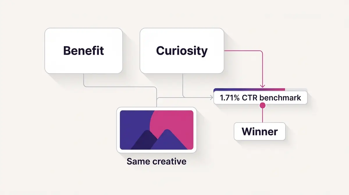
A single headline is a guess, and a guess against a 1.71% benchmark is not a strategy. The reliable path is to write a handful of genuinely different lines and let delivery sort them. A practical set of five for one creative looks like this: a plain benefit, a curiosity hook, a proof or number line, an offer-forward line with the price or deadline in the headline itself, and a question. Five distinct angles, each legible at 25 characters, each able to stand alone when the description vanishes.
Once you have the variants, the discipline is to compare them cleanly. Run them as a proper A/B test through Meta's Experiments tools so the result comes from delivery, not from eyeballing which one feels stronger, and so the winner is the line your audience actually clicked rather than the one you liked best. Keep every variant legible at 25 characters and able to stand alone when the description vanishes, so what you are testing is the message, not which line happened to render in full.
This is the loop worth building: generate several on-brand variants quickly, keep the ones that read complete on a phone, and let click-through rate retire the rest. A platform like AdPlay.ai can generate on-brand creative with up to five headline variants ready to A/B test and launch to Meta, keeping the focus on the part that moves the number rather than on staring at a 40-character box. Once the test resolves, fold the winner back into your control and start the next round. For the upstream hook and body copy that feed the same ad, the companion piece on Facebook ad copywriting covers the primary-text rules, and Facebook ad A/B testing walks through structuring the experiment so the result is real and not noise.
Example ad angles
Representative hooks and formats from the category.
“Before and After ad for dark spots faded with a clinic offer named in the headline”
“Curiosity Hook ad for the K-beauty step no one mentioned”
“Social Proof ad for three million bottles sold, stated as a number in under 40 characters”
By the numbers
Frequently asked questions
How long should a Facebook ad headline be in 2026?
The field allows roughly 40 characters, but the right length depends on where the ad runs. Sprout Social recommends roughly 25 to 27 characters for the Facebook Feed headline, where it wraps or clips first on a phone, and up to 40 for Stories and Reels. A safe working rule is to write the headline so its core meaning survives at 25 characters or fewer, then let it extend only in placements that show more. Short is not a performance law, it just means the line is more often fully visible on mobile.
Why does my Facebook ad description not show up?
Because the link-description field only renders reliably in a handful of placements: Marketplace, Search, In-Stream video, and Audience Network, per Meta's own Ads Guide, which lists the description for those placements and omits it from the Feed. On the mobile Feed and in Reels and Stories, the description simply does not appear. That is why so many advertisers think a field is broken when it is working as designed. Whatever you put in the description is invisible to most of your audience, so the headline has to carry the offer alone.
What is the difference between the headline, primary text, and description?
Primary text is the body copy above the creative, the home of your hook, cut by a See More link at roughly 125 characters on mobile. The headline is the bold line below the creative, beside the call-to-action button, capped near 40 characters. The description is an optional supporting line beneath the headline that renders in only a few placements. They are three separate fields with three different visibility rules, and the headline is the one most likely to stand alone.
Should a Facebook headline use a benefit or a curiosity hook?
Both work, and which wins is a test, not a rule. A benefit headline names the outcome plainly (dark spots faded, free same-day delivery) and suits warm or high-intent audiences. A curiosity headline withholds the payoff to earn the tap and suits cold traffic that needs a reason to stop. Write one of each, run them against the same creative and audience, and let click-through rate decide. WordStream puts the all-industry Traffic CTR bar at 1.71% in 2025, so that is roughly what a tested headline competes against.
Do emojis work in Facebook ad headlines, and do they help or hurt?
They render, but spend them carefully. An emoji shows as a single glyph yet can eat the width of two or three characters in a field where only about 25 may be visible, so one fire icon can be the reason your last word wraps off-screen. A single, well-placed emoji that reinforces the message (a checkmark before a guarantee, a small arrow pointing at the offer) can lift attention. A row of decorative icons reads as noise and is one of the patterns ad review treats as sensational. The rule of thumb is at most one, only where it earns its width, and never in place of a word that carries meaning.
Can I use a different headline for each placement without duplicating the ad?
Yes. Placement asset customization, a feature in Meta Ads Manager, lets you set a different headline (and primary text, media, and call-to-action) for each placement inside one ad, so you can write a 40-character Stories line and a tighter Feed line without building two separate ads, per Meta's Business Help Center. It is the precise fix for the Feed-versus-Reels length conflict: one ad, one set of metrics, copy tuned to each surface. Reach for it instead of splitting the ad when the only thing that needs to change between placements is the wording.
Is there a See more for a long headline, or does it just get cut off?
It just gets cut off. Primary text gets a See more link at roughly 125 characters on the mobile Feed that a reader can tap to expand, but the headline has no such control. When the line runs longer than the placement shows, Meta truncates it with an ellipsis and the viewer has no way to reveal the rest. That is the real reason the first characters have to carry the meaning: a clipped headline is gone, not hidden, so a line whose point lives in word eight is a line most of your audience never finishes.
What makes a Facebook headline get rejected?
Headlines that assert personal attributes (implying the viewer's health, age, or financial status), make absolute or sensational claims, or stuff in symbols and all-caps to grab attention are the usual triggers. The fix is to phrase the benefit as a general statement about the product rather than an assumption about the reader, and to drop the gimmick punctuation. A clean, specific headline clears review faster and tends to read better anyway.
Sources
- 1.Sprout Social, Always Up-to-Date List of Facebook Ad Sizes & Specs (updated Aug 22, 2025) (2025)
- 2.WordStream, Facebook Ads Benchmarks 2025: New Data & Insights by Industry (2025)
- 3.Meta Ads Guide, Ad formats and placement specifications (description field by placement) (2025)
- 4.Shopify, Facebook Statistics for Business Owners (citing Statista, 98.5% mobile) (2025)
- 5.Databox, What Is a Good CTR for Facebook Ads? (median 1.54%) (2024)
- 6.DataReportal, Essential Facebook Stats (Jan 2025 ad reach) (2025)
- 7.Meta Business Help Center, Creative best practices for text in ads (2025)
- 8.Social Media Today, Facebook Is Removing Its Restrictions on Text Content in Facebook Ad Images (Sep 22, 2020) (2020)
- 9.Meta Business Help Center, About asset customization for placements (2025)
- 10.Meta Business Help Center, About Advantage+ creative (2025)
Keep exploring
Turn ad research into winning ads
Research the ads that work, generate the creative on-brand, and launch to Meta, all in one tool.
7-day free trial · No credit card required