Facebook Ad CTA Buttons: Which to Pick (2026)
A decision guide for the Facebook ad CTA dropdown: Shop Now vs Learn More vs Sign Up vs Download, mapped to your objective and the post-click promise.
Updated August 2026 · Likit Sae Lee, CTO
Pick the Facebook ad CTA button by matching it to two things: your campaign objective (which gates the available buttons) and the promise on the page the click lands on. For cold traffic, the soft Learn More button is the expert default: a Databox survey of 40-plus marketers found it both the most-used button and the one that drove the most results, on the logic that people on Facebook are not ready to buy on first sight. But Learn More does not always win. In a controlled 2018 AdEspresso test the Download button beat it at $5.10 per lead versus $9.94, because the offer was a downloadable ebook and the button matched that promise exactly. Match the button to what happens after the click, and let the objective narrow the list.
You build the whole ad, the image, the headline, the primary text, and then you hit a small dropdown with thirty-odd options and freeze. Shop Now or Learn More? Sign Up or Download? It feels like a throwaway field, so most people pick on instinct and move on. That instinct is where money leaks. The button sets the expectation a person carries into the click, and when it clashes with the page they land on, the click was wasted. The good news is the choice is mostly mechanical: your objective rules out the wrong buttons, and your landing page picks among the rest.
The button is a promise, not a decoration
Every CTA button sets an expectation. When someone reads Shop Now, they brace for a product page and a price. When they read Learn More, they expect to read, not to buy. When they read Download, they expect a file. The click happens in the half-second between the button and the landing page, and if those two things disagree, the click was paid for and wasted.
That is why the question is rarely "which button is best" in the abstract. The button is best when it matches what happens next. A Databox survey of more than 40 marketing contributors found that 78.1% of respondents say ads with a CTA button perform significantly better than ads without one, so the first decision is simply to use one. Treat that as expert consensus rather than a controlled benchmark, because it is a panel of opinions, not a single test. But it points the same way as the harder evidence below.
The dropdown itself is deceptively large. Meta offers more than 30 CTA options in Ads Manager, from Shop Now and Learn More to Book Now, Get Quote, Subscribe, Get Offer, Apply Now and See Menu. You will never see all of them at once, because Meta only surfaces the buttons that fit your campaign objective, ad format and destination. The full list is also a moving target, so confirm the live options in Ads Manager before you publish rather than trusting any blog's screenshot, this one included.
The full menu: what each button promises
Before you match a button to a promise, it helps to see the whole menu in one place, because the dropdown rarely shows it all at once. Here is the catalogue of standard buttons, what each one signals, and the destination it naturally points to. Read the right-hand column as the page (or thread, or dialer) that should sit behind the click.
| Button | What it promises | Natural destination |
|---|---|---|
| Shop Now | Browse and buy now | Product or collection page |
| Learn More | More information, no commitment | Article, explainer, or landing page |
| Sign Up | Register or join | Signup form, waitlist, or instant form |
| Subscribe | Opt in to something recurring | Subscription or membership page |
| Download | Get a file or resource | Ebook, checklist, or app listing |
| Get Offer | Claim a specific deal | Offer or promotion page |
| Book Now | Reserve a time | Booking calendar or appointment page |
| Get Quote | Request pricing | Quote form, often an instant form |
| Apply Now | Submit an application | Application form |
| Contact Us | Reach the business | Contact form or message thread |
| Send Message | Start a chat | Messenger conversation |
| Send WhatsApp Message | Open a WhatsApp chat | WhatsApp conversation |
| Call Now | Dial the business | Phone dialer on mobile |
| Order Now | Place an order | Checkout or order page |
| Get Directions | Find a location | Map |
| See Menu | View what is on offer | Menu page |
| Watch More | Keep watching | Video |
| Listen Now | Play audio | Music or podcast destination |
| Donate Now | Give to a cause | Donation or fundraiser page |
| Install Now | Install an app | App store listing |
| Play Game | Start playing | A game |
Two things are worth noticing. Most of these are not interchangeable: Book Now and Order Now both ask for action, but one expects a calendar and the other a checkout, so a Book Now click sent to a product page breaks the promise. And the live list is only a subset of this, filtered by your objective, format and destination, so a button may simply not appear for the campaign you are building. For an ecommerce store the default is Shop Now (browse and buy); Order Now suits a direct or food order, and Buy Now, where it shows, signals an immediate one-item purchase. Your objective decides which slice of the menu you get.
Your objective narrows the list before you choose
The CTA dropdown is not freely yours. Meta's simplified objective set, Awareness, Traffic, Engagement, Leads, App promotion and Sales, decides which buttons even appear. Awareness, Reach and Video-Views objectives show a restricted set built around soft asks, because Meta is optimising to show your ad widely, not to drive a transaction. Conversion-oriented objectives like Sales and Leads unlock the harder buttons, Shop Now, Sign Up, Get Quote, that signal intent.
This gating is a feature, not an obstacle. It stops you from putting a Shop Now button on a campaign Meta is delivering for cheap reach, where the audience is wide and cold. The mismatch would simply burn impressions on people the system never selected for purchase intent.
A common point of confusion is where the button actually lives. You choose it at the ad level in Ads Manager, or inside the boost flow on a post, not in Meta Business Suite settings. Business Suite manages your Pages and Instagram presence; Ads Manager is where the ad is built and the CTA is set. If you cannot find the dropdown, you are probably in the wrong tool. And if a button you expect is greyed out, the cause is almost always the objective or the destination, not a bug: a button tied to an instant form will not appear unless the campaign is set up to use one (our guide on Facebook lead ads covers those instant-form buttons). The boost flow on a post also offers a shorter menu than the full Ads Manager build, so if your button options look unusually thin, that is often why. The button also renders differently by placement, sitting under the copy in the feed but overlaid on Reels and Stories, which our guide on Facebook ad placements maps out.
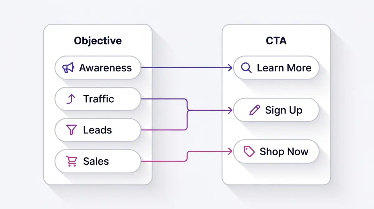
You can see the same logic in WordStream's 2025 benchmark data, drawn from hundreds of US campaigns. Traffic-objective campaigns, the ones that pair with low-friction buttons like Learn More, averaged a 1.71% CTR at a $0.70 CPC. Leads-objective campaigns, which pair with harder buttons like Sign Up and Download on an instant form, averaged a higher 2.59% CTR but a much higher $1.92 CPC. The Leads click costs more because it commits to something: a form, an intent, a next step. That price gap mirrors the friction of the button itself. A click that only promises to read is cheap; a click that promises to act is dear.
| Objective | Typical buttons | 2025 avg CTR (US) | 2025 avg CPC (US) |
|---|---|---|---|
| Traffic | Learn More | 1.71% | $0.70 |
| Leads | Sign Up, Download, Get Quote | 2.59% | $1.92 |
So before you agonise over Shop Now versus Learn More, look at the objective. Half the decision is already made for you.
Picking a button does not change what Meta optimizes for
A myth worth killing early: choosing Shop Now does not tell Meta to optimize for purchases. The button is just a label on the creative. What the system actually optimizes toward, the conversion location and the optimization event, is set separately at the campaign and ad set level when you pick the objective and the result you want counted. You can even run a Shop Now button on a campaign optimized for link clicks. So when an ad pulls clicks but no sales, swapping Shop Now for Buy Now will not fix it, because neither button is the lever. The levers are the optimization event, the audience, the offer, and the creative. The button only makes sure the click lands somewhere that honours the promise; it does not decide who sees the ad or what counts as a win.
Why Learn More wins for cold traffic
Among all the options, one button has a reputation, and the reputation holds up. When Databox asked its panel which button performs best, Learn More came out as both the most widely used and the one that drove the most results, with Shop Now and Download next. Their summary is worth quoting in plain terms: if you are torn between Shop Now and Learn More, choose Learn More, because people on Facebook are not ready to buy directly.
That is the whole logic of cold traffic in one line. A person scrolling their feed did not come to shop. They came to be entertained and distracted. An ad that asks them to buy on first contact is asking a stranger to marry on a first date. Learn More lowers the ask to something a curious stranger will accept: a click to find out more, with no implied transaction. It is the soft entry to a funnel, not the close.
This is also why Learn More pairs naturally with Traffic campaigns and content landing pages. A brand like Dherbs running a detox and wellness explainer is not trying to checkout a cold viewer. It is trying to teach, earn a little trust, and pixel the visitor for a warmer follow-up ad. Learn More fits that exactly: it promises information, and the page delivers information. If you want a deeper map of which message belongs at which funnel stage, our guide on the Facebook ad funnel from TOFU to MOFU to BOFU breaks the stages down.
There is a second reason Learn More carries cold traffic so well: it manages the bar that the algorithm and the human apply at the same time. A soft ask earns clicks from a wider slice of the cold audience, which gives Meta more signal to learn from early in the campaign, while still pointing those clicks at a page that can do the persuading. You are not closing on the impression; you are buying the chance to make a longer case on a page you control. That is exactly the job a top-of-funnel ad is supposed to do.
Keep the consensus in proportion, though. Databox's finding is qualitative, the pooled judgement of experts, not a single controlled experiment. It tells you Learn More is a strong default for cold audiences. It does not tell you Learn More always wins. The next section is where that nuance bites.
When Learn More loses: match the button to the promise
Here is the test that keeps the rule honest. AdEspresso ran a controlled 11-day, $1,000 experiment, spending about $250 per variation, on a single lead ad offering a free ebook. The results, by cost per lead:
| CTA button | Cost per lead | Leads |
|---|---|---|
| Download | $5.10 | 49 |
| Sign Up | $9.62 | 26 |
| Learn More | $9.94 | 36 |
| No button | $12.50 | 20 |
Download won, and it was not close. It beat Learn More nearly two to one on cost per lead. The reason is the entire point of this guide: the offer was a downloadable ebook, so Download was the literal promise-match. The person clicking knew exactly what they would get, and the button confirmed it. Learn More, the supposed champion, came third here, because Learn More promises reading and the page delivered a download. Treat these figures as directional given the 2018 date and the vendor source, but the direction is unambiguous.
The no-button variant is its own lesson. It cost $12.50 per lead, about 2.5 times the winning Download button. That is the strongest single argument for using a button at all: removing it did not make the ad cleaner, it made each lead cost more than double.
So the rule that survives every dataset is not "use Learn More." It is "use the button that names what happens after the click." A downloadable resource gets Download. A product page gets Shop Now. An appointment gets Book Now. A pricing request gets Get Quote. A waitlist or newsletter gets Sign Up. The button is a tiny piece of copy doing the same job as your headline: setting an accurate expectation. Our guide on writing the Facebook ad headline goes deeper on aligning those two fields so they reinforce, rather than contradict, each other.
More clicks is not more results
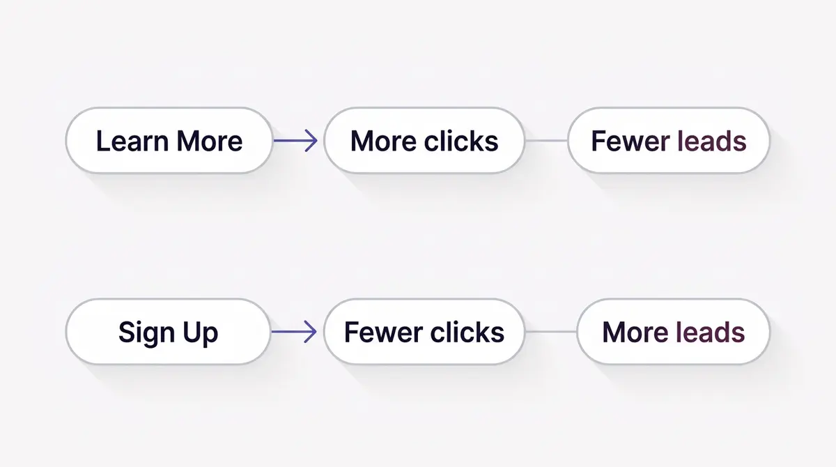
There is a trap inside all of this, and it has a number. An older AdEspresso test, confirmable here only through a secondary citation, found that switching a Sign Up button to Learn More lifted CTR by about 22.5%. A win, on the surface. Except the same test showed Sign Up produced roughly a 14.5% higher conversion rate. Read that as directional given its age and secondhand source, but the lesson is durable.
The soft button pulled in more clicks, and a chunk of those clicks came from people who were never going to convert. They were curious, not committed. Learn More invited the tyre-kickers; Sign Up filtered them out at the door, so the people who did click were closer to acting. Higher CTR, worse conversion rate.
This is why you cannot judge a button by clicks. A softer CTA almost always wins on CTR, because asking for less always earns more yeses. The question is whether those extra yeses are worth anything. Judge the button on cost per result: cost per lead, cost per purchase, cost per booking. If a harder button drops your CTR but lowers your cost per actual outcome, the harder button won. Our guide on Facebook ad copywriting covers the same trap in the body copy, where a clever hook can win attention and lose the sale.
The button label versus the CTA in your copy
There are really two calls to action in a Facebook ad, and they do different jobs. One is the button, a fixed label from Meta's dropdown. The other is the written call to action in your primary text, your headline, or on the creative itself, the line that says "Grab 20% off before Sunday" or "Get your free sizing guide." People conflate the two, then wonder why the button feels weak. It is supposed to. The button is the plain, literal name of the action. The persuasion lives in the words you write.
So let the button stay simple and let the copy carry the urgency, the benefit, and the specifics. The button might read Shop Now; the primary text is where you say what is on sale and why today. If you catch yourself wishing the button could say "Download your free 2026 planner," that is your copy talking: write that line in the text and let the button stay Download. The two reinforce each other, the copy makes the case and the button confirms the next step in two unmissable words. Our guide on copywriting frameworks for ads covers how to build that written CTA.
What you cannot control: the button is a fixed preset
A lot of generic call-to-action advice tells you to make the button a bold colour, add an icon, or design it to stand out. None of that applies on Meta. You pick a preset from the dropdown and set the destination, and that is the entire input: there is no field for custom text, colour, icon, or font. Meta renders the button in its own native styling so it stays consistent across the feed. The only two things you control are which preset you choose and where it sends the click.
That has a consequence many advertisers learn the hard way: you cannot quietly swap the button on a running ad. Editing the creative on a live ad sends it back through review, and a significant edit can reset the learning phase. On ads built from an existing Page post, the button can be locked once the post has collected likes and comments. The clean workaround is to duplicate the ad, change the button on the copy, publish that for review, and turn off the original once the new one is live.
A practical map: which button for which job
Strip away the theory and the choice comes down to a short lookup. Find the row that matches your objective and your landing promise, and the button picks itself.
| Situation | Objective | Landing promise | Button |
|---|---|---|---|
| Cold audience, content offer | Traffic | Article, quiz, blog post | Learn More |
| Product-aware shopper | Sales | Product or collection page | Shop Now |
| Lead magnet, downloadable file | Leads | Ebook, checklist, guide | Download |
| Newsletter or waitlist | Leads / Traffic | Signup form | Sign Up |
| Service appointment | Leads | Booking calendar | Book Now |
| Pricing or estimate | Leads | Quote form | Get Quote |
| Application | Leads | Application form | Apply Now |
Real campaigns map onto this cleanly. A brand like Medicube selling to a product-aware skincare shopper runs a Shop Now button pointed straight at a collection page, where the warm visitor expects to browse and buy. A brand like UR Klinik, an aesthetic clinic, runs Book Now on a Leads campaign, because the promise is an appointment, not a purchase. And an insurance explainer from a brand like Perunding Takaful-Thaqif Alif might run Learn More on the cold first touch, where the job is to educate, then switch to Sign Up on the retargeting ad once the viewer is warm and an instant form is the next step.
Notice the pattern. The same advertiser uses different buttons at different funnel stages, because the promise changes as the audience warms up. Cold gets the soft button and the educational page. Warm gets the hard button and the form or product page. The button is the funnel stage, expressed in two words.
A few buttons reward a second look. Get Offer signals a discount or coupon and works when the landing page leads with the deal; pair it with a real promotion, not a vague one, because the click expects to see the offer it was sold. Subscribe suits content and membership pages where the next step is recurring, not a one-off buy. Contact Us is honest for service businesses whose conversion is a conversation, though it asks more than Learn More and should sit on a warmer audience. Apply Now belongs to anything with a genuine application step, jobs, financing, programmes, where calling it Sign Up would understate the commitment and attract the wrong clicks. In each case the same discipline holds: the two words on the button should be the truest available description of what the person is about to do.
When the next step is a chat, a call, or an install
Everything so far assumes the click lands on a page. A large class of campaigns does not work that way: the promise is a reply, a phone call, an install, or a visit, and the button has to match that instead.
When the conversion is a conversation, the button opens a thread, not a webpage. Send Message starts a Messenger chat, Send WhatsApp Message opens a WhatsApp conversation, and Contact Us routes the person to the contact method you set. These suit businesses that close in a back-and-forth: a service quote, a booking question, a product enquiry. There is no landing page to match, so the rule shifts: the button promises a reply, so someone has to be ready to reply. A Send Message ad pointed at an inbox nobody watches wastes the click.
Local businesses have their own family. Call Now dials your number from a phone, Get Directions drops the person into a map, and See Menu shows what is on offer before they visit, each catching a nearby customer mid-decision. App advertisers get a third set: Install Now and Use App send people to the app store or open the app, and these appear only under the App promotion objective. In every case the discipline is unchanged: the button names the next step, and the next step has to actually exist.
Common CTA button mistakes
Most CTA problems are a handful of the same errors:
- A hard button on cold traffic. Shop Now on a first-touch ad to people who have never heard of you asks a stranger to buy on sight. Soften it to Learn More and let the page warm them up.
- A button that does not match the landing page. A Book Now that lands on a product grid, or a Download that lands on a homepage, spends the click and breaks the promise.
- Defaulting to Learn More on everything. It is a strong cold-traffic button, not a universal one. On a warm, ready-to-buy audience a softer button just leaves conversions on the table.
- Running no button at all. Outside a pure awareness play, the evidence says a missing button costs you: in AdEspresso's test the no-button ad cost about 2.5 times more per lead than the best button.
- Never testing it. The button is one of the cheapest variables to test cleanly, yet many advertisers set it once and never touch it again.
Testing the button, and letting it be set for you
Because the button text is fixed to Meta's preset list and cannot be free-typed, it is one of the easiest variables to test cleanly. Duplicate your best ad, change only the button, and split the spend. With everything else held constant, the difference in cost per result is the button's effect, isolated. It is a cheaper test than reworking creative, and the AdEspresso experiment shows the gap between the best and worst button can be more than double on cost per lead.
A few guardrails make the test honest. Keep the destination identical across variants, or you are testing two things at once. Give each variant enough budget to clear noise; AdEspresso's roughly $250 per variation is a reasonable floor for a lead test, less for cheaper objectives. And read the result on cost per result, not CTR, for the reason the earlier section laid out. Our guide on Facebook ad creative testing covers the method, and it applies directly to the button as a variable.
The deeper habit is to stop treating the dropdown as an afterthought. The button is the last word your ad says before the click, and it should agree with the first word your landing page says after it. Objective narrows the list, the landing promise picks the winner, and a quick test confirms it.
When you generate and launch a creative in AdPlay.ai, the CTA button is set for you to match the objective and the landing promise, so the button never quietly contradicts the page behind it. The decision in this guide becomes a default rather than a gamble. Either way, the principle is the same: choose the button for the promise it makes, measure it on the result it drives, and let the objective do the narrowing first.
Example ad angles
Representative hooks and formats from the category.
“Shop Now ad for a product-aware shopper sent straight to a collection page”
“Learn More ad for a cold-traffic detox explainer that lands on an article, not a checkout”
“Book Now ad for a high-intent clinic consultation booking”
By the numbers
Frequently asked questions
What is the best CTA button for Facebook ads in 2026?
There is no single best button, only the best match. For cold traffic that does not know you yet, Learn More is the safe default: a Databox survey of more than 40 marketers found it both the most-used and the highest-performing button. For warm, product-aware shoppers, a harder button like Shop Now or Sign Up converts better. The deciding factor is the page behind the click: if you promise a download, use Download; if you promise a booking, use Book Now.
Does Learn More always beat Shop Now?
No. Learn More tends to win for cold audiences because it asks for less commitment, but it loses when the offer is concrete. In AdEspresso's 2018 test the Download button beat Learn More ($5.10 vs $9.94 per lead) because the offer was a downloadable ebook. Match the button to the promise: Learn More for an article or quiz, Shop Now for a product page, Download for a file, Book Now for an appointment.
Do CTA buttons actually matter, or is it just the creative?
They matter enough to measure. In Databox's expert survey, 78.1% of respondents said ads with a CTA button perform significantly better than ads without one. In AdEspresso's controlled test, dropping the button entirely raised cost per lead to $12.50 versus $5.10 for the best button, roughly 2.5 times worse. The creative does most of the heavy lifting, but the button is a cheap, fast variable to test.
Why can't I see Shop Now in my CTA dropdown?
Meta gates the available buttons by campaign objective, ad format and destination. Awareness, Reach and Video-Views objectives show a restricted set, while conversion objectives like Sales and Leads unlock Shop Now, Sign Up and similar. If a button you want is missing, check that your objective and destination support it. The live list changes, so confirm in Ads Manager before you publish.
Which CTA button should I use for lead generation?
For a Leads-objective campaign with an instant form, Sign Up, Download, Get Quote or Apply Now usually fit best because they signal the form-fill that follows. The button should describe what the person gets, not what you want. Use Download for a guide or checklist, Get Quote for pricing, Sign Up for a waitlist or newsletter, and Apply Now for an application.
Which CTA button should I use for Messenger or WhatsApp ads?
For a click-to-message campaign, match the button to the channel: Send Message opens a Messenger thread and Send WhatsApp Message opens a WhatsApp chat. Contact Us fits when you want a general enquiry routed to your chosen method. The promise here is a reply rather than a landing page, so the one rule that matters is that someone is actually watching the inbox. A messaging ad that opens a thread nobody answers wastes the click as surely as a Shop Now pointed at a dead link.
Can I write my own custom CTA button text, or change its colour?
No. The button is a fixed preset: you pick from Meta's dropdown (Shop Now, Learn More, Sign Up, Download, Book Now, Get Quote, Subscribe, Contact Us and so on) and set the destination. You cannot free-type the label or change its colour, icon, or font, and you cannot quietly edit the button on an ad that is already live. To change it you edit the ad, which sends it back through review, or you duplicate the ad and change the button on the copy. If no preset fits perfectly, pick the closest match to the post-click action and carry your specific phrasing in the headline and primary text instead.
Does a higher click-through rate from a softer button mean better results?
Not necessarily. A softer button like Learn More can pull more clicks from people who are merely curious, which lifts CTR without lifting conversions. In an older AdEspresso test, switching Sign Up to Learn More raised CTR by about 22.5% but Sign Up still produced a roughly 14.5% higher conversion rate. Judge the button on cost per result, not on clicks alone.
Sources
- 1.Databox, Facebook CTA Buttons: Which Buttons Perform the Best on Facebook Ads? (2021)
- 2.AdEspresso, What's the Best CTA For Your Facebook Ads? (a $1,000 Experiment) (2018)
- 3.WordStream / LocaliQ, Facebook Ads Benchmarks 2025 (2025)
- 4.Meta Business Help Center, About call-to-action buttons in Meta Ads Manager (2026)
- 5.Meta Business Help Center, Available call-to-action buttons in Ads Manager (2026)
- 6.Meta for Developers, Marketing API: Ad Creative Link Data Call To Action (type values) (2026)
- 7.Meta Business Help Center, Troubleshoot call-to-action buttons for existing Facebook post ads (2026)
- 8.Coinis, Best Facebook Ad CTA (secondary citation of AdEspresso's CTR finding) (2025)
Keep exploring
Turn ad research into winning ads
Research the ads that work, generate the creative on-brand, and launch to Meta, all in one tool.
7-day free trial · No credit card required