
Instagram Stories Ads: A How-To Guide (2026)
How to run Instagram Stories ads in 2026: the 9:16 spec, safe zones, first-frame hook, link sticker CTA, and why repurposed feed creative wastes the screen.
Updated August 2026 · Likit Sae Lee, CTO

Instagram Stories ads run full-screen vertical 9:16, with 1080 x 1920 pixels the standard production resolution (Meta recommends 9:16; Sprout Social lists a higher 1440 x 2560 minimum, 2025). Keep text and logos out of the top 14% (250px) and bottom 20% (340px), the band where the reply bar and link-sticker CTA sit (Meta Business Help Center, 2025). Aim for a hook in the first frame and a tight 6 to 15 second card. A square feed creative dropped into a Story covers only about 56% of the canvas, wasting roughly 44% of the screen, which is why a Stories-native asset beats a repurposed feed crop.
You exported one ad, ticked every placement, and your perfectly composed feed creative now floats in the middle of the screen with black bars top and bottom. Stories is a different canvas, not a smaller version of the feed, and treating it like one quietly burns a third of the most attention-dense surface Meta sells. This page walks through the spec that matters, the safe zones text keeps hiding behind, the first-frame hook that decides whether anyone watches past the swipe, and the link sticker that actually moves the tap. Build the 9:16 once, on purpose, and Stories stops being the placement you tolerate.
The Stories canvas is a different shape, not a smaller feed
Instagram Stories ads run full-screen vertical 9:16, with 1080 x 1920 pixels the standard production resolution for that ratio (Meta recommends 9:16; Sprout Social lists a higher 1440 x 2560 pixel minimum, 2025). That is the whole point of the placement: the ad owns the entire phone, edge to edge, with no surrounding UI competing for the eye. A feed ad lives in a scroll with a caption, comments, and the next post peeking up from below. A Story is the only thing on screen. The reward for getting it right is undivided attention; the penalty for getting it wrong is an ad that announces, in the first half second, that it was not made for this surface.
Image ads upload as JPG or PNG up to 30 MB (Sprout Social, 2025). Video uploads as MP4 or MOV. Those are the easy specs. The rule people actually break is the safe zone, and it is worth stating plainly before anything else because it shapes every layout decision that follows.
There is a scale reason to care, too. Instagram's global advertising reach sits at about 1.74 billion users, or 21.3% of the world population (DataReportal, 2025), and Stories inventory sits inside that pool. The placement is not a sideshow; it is one of the highest-attention surfaces the platform sells, precisely because it is full-screen and uninterrupted. A sloppy Stories execution is therefore expensive: the surface delivers volume, so a creative that underperforms here drags a real share of the campaign.
The safe zone is the load-bearing rule
Meta's own design guidance and the independent specs agree on this, which is rare enough to trust. Keep your text, logo, and any element you cannot afford to lose out of the top 14% (about 250 pixels) and the bottom 20% (about 340 pixels) of the 9:16 canvas (Meta Business Help Center, 2025; Sprout Social, 2025). The top band is where the profile icon, account name, and the small progress bars sit. The bottom band is the busy one: it holds the reply bar and, for ads, the tappable link sticker or CTA button. Anything you place there gets covered or competes with the interface.
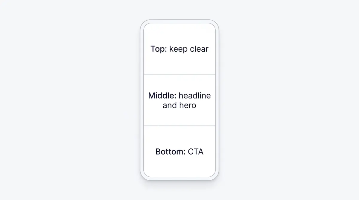
The bottom 20% deserves special respect because it is doing double duty. Your CTA renders there, so you want it clear of your own graphics, and the viewer's reply bar lives there too. A logo or a line of body copy parked in the bottom band is the classic Stories mistake: it looks fine in your design tool and then sits half-hidden behind the link sticker in the live placement. Design the center 66% as your working area, and treat the top and bottom as Meta's, not yours.
There is a practical tip when one 9:16 master runs across both Stories and Reels. Reels reserves a larger bottom margin, roughly 35%, against Stories' 20%. If a single asset serves both, design to the larger Reels margin so your CTA never clips on either surface. You lose a little usable height, but you stop maintaining two near-identical files.
Verify the layout instead of trusting it. The Ads Manager creative preview includes a Safe Zone Guardrail overlay that shades the UI-covered areas directly on your asset (Meta Business Help Center, 2025). Toggle it on before you publish; it takes ten seconds and catches the clipped headline you cannot see in your design file. A quick mental checklist before any Stories ad ships: is the top 14% empty, is the bottom 20% empty, does the headline survive a small device crop, and does the CTA sit clear of the reply bar. If all four are yes, the layout is sound regardless of how clever the creative is.
One subtlety worth flagging: the safe zone is about placement, not about leaving the screen visually empty. Fill the full 9:16 with imagery, gradient, or video. What you keep out of the top and bottom bands is meaning, the words, logos, and key visual moments a viewer has to read. A face can run edge to edge; the line of body copy describing it cannot sit in the bottom 340 pixels. Confuse the two and you get a timid, centered card surrounded by dead space, which throws away the full-screen advantage that makes Stories worth running.
Why a repurposed feed creative wastes the screen
Here is the arithmetic that makes the case for Stories-native creative, and it is just geometry off the canonical spec. The Stories canvas is 1080 x 1920 pixels. A square 1:1 creative is 1080 x 1080. Drop it into the Story and it covers 1080 of the 1920 pixels of height, or about 56% of the canvas. The other 44% fills with black bars or a stretched, blurred version of your own image. You paid for a full-screen placement and used a little over half of it.
| Source creative | Coverage in a 9:16 Story | Screen wasted |
|---|---|---|
| Square 1:1 (1080 x 1080) | about 56% | about 44% |
| Vertical 4:5 (1080 x 1350) | about 70% | about 30% |
| Stories-native 9:16 (1080 x 1920) | 100% | 0% |
So a repurposed feed asset wastes roughly 30 to 40% of the screen, and up to 44% in the square case. That is computed from the spec, not a quoted benchmark, and the math holds whichever feed crop you start from. The wasted band is not neutral space. It is where attention drains, where the ad reads as an afterthought, and where a competitor who built natively looks more professional by comparison.
Meta tries to soften the gap by filling the empty bands with a blurred copy of your image or by stretching the asset to fit. Neither rescues the ad: the blur reads as a placeholder, the stretch distorts faces and product shapes, and both signal that the creative was made for somewhere else. The viewer does not think wasted 44% of the canvas; they feel this looks slightly off, and they swipe. On a surface where the first second is the whole audition, a slightly-off opening is a lost impression.
The performance case for going vertical is directional but consistent. In Facebook's own A/B test, vertical video beat an identical square ad on brand lift 70% of the time, with a 3 to 9 point lift in ad recall (IdeaRocket, 2024). Treat those as directional, since they come from a platform-run test, but the pattern repeats elsewhere: vertical video has been reported to drive up to 80 to 100% higher completion rates on mobile than horizontal (Wyzowl, 2026). Read that as directional too, since it rests on undated aggregator surveys rather than dated primary research. It is not mysterious why. A directional figure puts at 94% the share of people who hold their phone vertically when watching video (Wyzowl, 2026), so a full-screen vertical ad matches the hand it lands in. A letterboxed square asks the viewer to watch a small rectangle in a big frame, and they do not.
The first frame is the whole ad
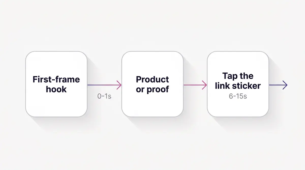
A Story auto-advances after a few seconds, and a single tap dismisses it. There is no scroll-back, no hover, no second chance. So the first frame is not an opening; it is the audition. If it does not communicate something worth staying for inside the first second, the rest of your beautifully composed card never gets watched.
That means the hook belongs in frame one, not after a logo sting or a slow product pan. Lead with the product in hand, the result on a face, the price tag, the question. A brand like Medicube can open a Stories card with the product already in frame and the routine demo underway, so the first half second answers what is this and why should I care. A brand like Shakura can open a before-and-after on a full-bleed 9:16 face shot, with the transformation legible before the viewer's thumb decides anything. The common thread is that nothing is held in reserve.
Keep the card tight. Meta allows a single Story card from 1 second to 60 minutes, but the format rewards a hook-first 6 to 15 seconds (Meta Business Help Center, 2025). If you have more to say, split it across cards so each one re-earns attention, rather than betting everything on one slow clip. And design for silence first: many viewers watch with sound off, so the visual and any on-screen text have to carry the message, with audio as a bonus rather than the load-bearing layer.
A few hook patterns translate especially well to the vertical full-screen card. The result-up-front open shows the after state in frame one, then earns the watch by explaining how, which is why before-and-after and demo angles suit Stories. The pattern-interrupt open puts an unexpected visual or a blunt question on screen before any branding. The price-or-offer open leads with the number, which works when the deal is the reason to act. What unites them is restraint about brand throat-clearing: a three-second logo sting is three seconds of the audition spent on the one thing the viewer already assumes. Put the logo small in the safe central area and let the hook lead. And resist the urge to cram a second headline or a row of feature icons onto the canvas; each addition slows the read. One idea per card, carried to the CTA, beats a dense slide every time.
Stories and Reels are siblings, not twins
It is easy to treat Stories and Reels as one vertical bucket, and they do share the 9:16 canvas. But the surfaces behave differently. Stories is ephemeral and intent-light: people tap through a sequence from accounts they follow, the ad slots between organic Stories, and the dominant action is a quick tap on the link sticker. Reels is a discovery feed that rewards entertainment and rewatch. So a Stories card can be more transactional, leading with offer and CTA, while a Reels ad usually has to entertain first and sell second.
The one production rule that bridges them is the bottom margin. Reels reserves more room at the bottom, around 35%, for its caption and controls, against Stories' 20%. If a single 9:16 master serves both placements, design to the larger Reels margin so nothing clips on either surface. That costs a little usable height on Stories but saves you from maintaining two near-identical files. With more capacity, two tuned cuts beat one compromise asset, but the shared master is a perfectly good starting point.
The link sticker is the action, not the swipe
The mechanic that turns a watched Story into a tap is the link sticker. This matters because the old habit dies hard: swipe-up was removed in August 2021 and replaced by the tappable link sticker (Social Media Today, 2021). Two consequences follow. First, your copy and voiceover should say tap the link or tap to shop, never swipe up; pointing people at a gesture that no longer exists makes the ad feel old and sends them hunting for an action they cannot find. Second, the link sticker rolled out to all eligible accounts by late 2021, with no 10,000-follower or verified requirement (Instagram Help Center), so the link is available to every advertiser by default.
For Stories ads, the CTA renders as a tappable link sticker or button anchored near the bottom of the screen. You can customize the verb, for example SHOP, BOOK, or LEARN MORE, to match the offer. That bottom anchor is exactly why the bottom 20% safe zone is non-negotiable: your CTA lives there, and your own graphics must not crowd it. A brand like Bene Jewellery can run a single hero necklace on-model at full 9:16, with a SHOP sticker clear at the bottom and nothing letterboxed; the path from saw it to tapped it is one clean gesture.
One more reason to respect the action: a clear, single CTA outperforms a card that buries three competing asks. Stories is a fast surface. One product, one promise, one tap.
It helps to point at the action explicitly. A small finger-tap motion, an arrow, or an on-screen line like tap to shop lifts tap-through because it tells the viewer the sticker is interactive, not decorative. Keep that nudge in the central area, not the bottom band where it would collide with the sticker. And match the verb to the funnel stage: SHOP for a ready-to-buy product, BOOK for a service, LEARN MORE for a considered purchase. The verb is free copy real estate, so do not leave it on the default when a sharper word fits.
Common Stories ad mistakes and the fix
Most underperforming Stories ads fail in one of a handful of predictable ways, and each has a one-line fix. Run a new card against this list before it ships.
| Mistake | What the viewer sees | Fix |
|---|---|---|
| Square feed asset reused | Black bars, about 44% wasted screen | Supply a 9:16 native asset via asset customization |
| Text in the bottom 20% | Copy half-hidden behind the link sticker | Pull all text into the central safe area |
| Slow logo intro | Branding before any reason to watch | Move the hook to frame one, shrink the logo |
| Swipe up in the copy | A gesture that no longer exists | Say tap the link or tap to shop |
| Three competing CTAs | Decision paralysis, a swipe | One product, one promise, one sticker |
| Sound-dependent message | Nothing lands with audio off | Carry the message in visuals and on-screen text |
None of these require a bigger budget. They require composing for the surface instead of borrowing from the feed. The card that respects the safe zone, leads with the hook, names the tap, and fills the full 9:16 will out-deliver a more expensive asset that does none of those, because it matches how the placement is actually watched.
Build the Stories asset on purpose
The whole guide reduces to one workflow change: stop letting the feed file fill the Stories slot, and supply a dedicated 9:16 asset instead. In Ads Manager, that is per-placement asset customization. Keep Advantage+ placements on if you want Meta's delivery breadth, but add a Stories-specific 9:16 creative so the placement serves your composed full-screen version rather than an auto-crop of the square.
| Approach | What Meta serves to Stories | Result |
|---|---|---|
| Advantage+ placements, single feed asset | Auto-cropped feed creative | Letterboxing, clipped text, about 30 to 44% wasted screen |
| Manual placement, feed asset reused | The same shape you uploaded | Same waste, just chosen on purpose |
| Per-placement asset customization, 9:16 native | Your composed full-screen card | Full canvas, safe CTA, hook-first frame |
Reformatting is not a full reshoot. A vertical-native cut can often be recomposed from existing footage or a tall hero image, with the hook moved to frame one, text pulled inside the safe zone, and the CTA placed clear of the bottom band. A brand like Afabelle Hijab can take a styling clip and rebuild it as a 6 to 8 second 9:16 card with a SHOP NOW sticker, rather than cropping a square feed post and hoping it reads.
A sensible routine makes this repeatable. Shoot or design tall from the start, so the 9:16 version is the master and any feed crops are derived from it, not the reverse. Storyboard the first frame deliberately, because that is the one that decides delivery. Keep a reusable safe-zone template so text never wanders into the bands. And A/B the hook, not just the offer: on Stories the opening second moves results more than almost any other variable, so testing two first frames against the same body and CTA is usually the highest-leverage experiment you can run.
If reformatting every winning ad into a clean 9:16 sounds like the bottleneck, it usually is, which is where tools that generate or reformat a Stories-native creative from your existing assets earn their keep; a platform like AdPlay.ai can produce the 9:16 card and push it straight to the Stories placement so the full-screen version is the one that ships. For the adjacent surfaces and the sizing details, see the Instagram Reels ads guide, the Facebook and Instagram ad sizes reference, and the Reels vs Stories ads comparison. Build the 9:16 once, with the hook in frame one and the CTA where the thumb already is, and Stories stops being the placement that wastes your best work.
Example ad angles
Representative hooks and formats from the category.
“How-to or Demo ad for pore-care results, shot vertical so the full screen is the product close-up”
“Before and After ad for brightening results, full-bleed 9:16 face shot with text kept inside the safe zone”
“Feature Callout ad for a hero necklace, 9:16 full-screen so nothing is letterboxed”
By the numbers
Frequently asked questions
What size should an Instagram Stories ad be in 2026?
Full-screen vertical 9:16; 1080 x 1920 pixels is the standard production resolution (Meta recommends 9:16, while Sprout Social lists a higher 1440 x 2560 minimum, 2025). Image ads upload as JPG or PNG up to 30 MB, and video uploads as MP4 or MOV. The single most important design rule is the safe zone: keep your text, logo, and key visual out of the top 14% (about 250px) and the bottom 20% (about 340px), because the profile icon sits up top and the reply bar plus the link-sticker CTA sit at the bottom (Meta Business Help Center, 2025).
How long should an Instagram Stories ad be?
Meta technically allows a single Story card from 1 second up to 60 minutes, but best practice is a tight, hook-first card of roughly 6 to 15 seconds (Meta Business Help Center, 2025). A Story auto-advances after a few seconds and a tap dismisses it instantly, so the job of the first frame is to earn the next one. If your message needs longer, split it across cards rather than stretching one slow clip that gets swiped away before the point lands.
Why does my feed ad look small with black bars in Stories?
Because the feed creative is a different shape. A square 1:1 image dropped into a 9:16 Story covers only about 56% of the canvas height (1080 of 1920 pixels), so roughly 44% of the screen fills with black or a blurred background. A 4:5 feed crop does better at about 70% coverage but still wastes around 30%. The fix is to supply a dedicated 9:16 asset for the Stories placement instead of letting Meta auto-crop the feed file.
How do I add a link to an Instagram Stories ad?
Stories ads carry a tappable link sticker or CTA button anchored near the bottom of the screen; the viewer taps it, they do not swipe. Swipe-up was removed in August 2021 (Social Media Today, 2021) and replaced by the link sticker, which rolled out to all eligible accounts by late 2021 with no 10,000-follower or verified requirement (Instagram Help Center). You can customize the sticker verb, for example SHOP or BOOK. Because the CTA renders at the bottom, that bottom 20% must stay clear of your own text and logo.
Do I still tell people to swipe up in Stories ads?
No. The swipe-up link mechanic was retired in 2021 and replaced by the link sticker (Social Media Today, 2021). Your on-screen prompt and voiceover should say tap the link or tap to shop, never swipe up. Pointing viewers at a gesture that no longer exists makes the ad look dated and sends them looking for an action they cannot find.
Is vertical video actually worth the extra production work?
The directional evidence says yes. In Facebook's own A/B test, vertical video beat an identical square ad on brand lift 70% of the time with a 3 to 9 point ad-recall lift (IdeaRocket, 2024). Separately, vertical video has been reported to drive up to 80 to 100% higher completion rates on mobile than horizontal, and 94% of people hold their phone vertically when watching video (Wyzowl, 2026). Treat all of these as directional: the brand-lift and recall figures come from a platform-run test, and the completion and 94% figures rest on undated aggregator surveys, not dated primary research. The direction is consistent even if the exact numbers are soft.
How do I make sure my CTA is not hidden behind the Stories UI?
Design to the safe zone first, then verify it. Keep the top 14% and bottom 20% clear in your layout, then use the Safe Zone Guardrail overlay in the Ads Manager creative preview, which shades the UI-covered areas so you can see whether any text or the CTA gets obscured (Meta Business Help Center, 2025). If one 9:16 asset runs across both Stories and Reels, design to the larger Reels bottom margin so the CTA never clips on either surface.
Can I just let Advantage+ placements handle Stories for me?
You can, and it is fine for reach, but Advantage+ placements will auto-crop your feed creative to fill the Stories surface, which is where the screen-waste and clipped-text problems start. The cleaner approach is per-placement asset customization: keep Advantage+ placements on for delivery, but supply a dedicated 9:16 Stories asset so Meta serves your composed full-screen creative instead of a stretched or letterboxed feed file.
Sources
- 1.Sprout Social, Always Up-to-Date List of Instagram Ad Sizes and Specs (2025)
- 2.Meta Business Help Center, Design Requirements for Instagram Stories Ads (2025)
- 3.DataReportal, Essential Instagram Stats (2025)
- 4.IdeaRocket, Vertical Video Guide (2024)
- 5.Wyzowl, Vertical Video Marketing (2026)
- 6.Social Media Today, Instagram Removing Swipe-Up Links, Replacing with Link Stickers (2021)
- 7.Instagram Help Center, About Link Sticker on Instagram Stories (2025)
Keep exploring
Turn ad research into winning ads
Research the ads that work, generate the creative on-brand, and launch to Meta, all in one tool.
7-day free trial · No credit card required