
Facebook Collection Ads: A How-To Guide (2026)
How collection ads work, why a cover video lifts taps over a static cover, the exact 2026 specs, and the steps to build and launch one in Ads Manager.
Updated August 2026 · Likit Sae Lee, CTO

A Facebook collection ad pairs one cover (image or video) with a grid of products underneath, and tapping it opens a full-screen Instant Experience to browse and shop. Meta's 2026 spec wants the cover at 1080 x 1080 px minimum, an aspect ratio between 1.91:1 and 1:1, with three product images showing under the cover on Feed and an Instant Experience landing page required. The cover is the whole game: ad guides report a cover video can lift interaction by up to roughly 20% over a static cover, because motion earns the tap. Build the cover to be tapped, not skipped.
You sell more than one thing, and a single image cannot carry a range. The collection format is Meta's answer: a cover that fills the feed, a row of products beneath it, and a full-screen storefront that opens the instant someone taps. Done well, it turns a scroll into a browse without ever leaving the app. Done lazily, it is a flat product photo over three thumbnails nobody touches. The difference is almost entirely the cover, the one asset that decides whether the tap happens. This is a guide to building that cover, getting the specs right, and launching the ad in today's Ads Manager.
What a collection ad actually is
A collection ad is a mobile-first format with two parts. On top sits a single cover, an image or a video that fills the feed. Beneath it, on Facebook Feed, three product images appear in a row. Tap anywhere on the ad and a full-screen Instant Experience opens inside the app, a fast-loading mini-storefront where people browse the full range and tap through to buy. The cover earns the tap; the Instant Experience holds the shop.
That structure makes collection the format for a range rather than a single offer. Where a carousel asks people to swipe through cards one at a time, a collection shows a cover and a curated shelf at once, then opens into a deeper grid on a single tap. The carousel guide covers the swipe-based alternative; collection wins when you want one hero asset on top and a browsable storefront underneath.
One detail trips up first-time builders: the Instant Experience is not optional. Meta requires collection ads to point to one, because the whole premise is a tap that becomes a browse without leaving the app. The Instant Experience is the full-screen destination that renders natively inside Facebook or Instagram rather than loading an external mobile site, which is why it appears near-instantly. Meta has long claimed it loads far faster than a standard mobile website; treat the exact multiple as a directional Meta-own figure, but the qualitative point holds, a native in-app screen beats a cold browser load. You build it from a template in Ads Manager, and a catalog can populate it automatically, but it has to exist before the ad can publish.
Why the cover does almost all the work
Look at how a collection ad is consumed and the priority is obvious. Everyone the ad reaches sees the cover; only the people it convinces tap into the grid. The thumbnails and the Instant Experience behind them are worthless until something earns that first tap, and the only thing that can is the cover.
This is why the cover-versus-static question matters more than any other creative choice in the format. Ad guides consistently favour motion: Instapage and other format guides report that a cover video can lift interaction by up to roughly 20% over a static cover image. Treat that 20% as directional, not gospel: it circulates in vendor guides without clean independent attribution and traces back to Meta's own best-practices material. What is reliable is the direction. A feed rewards movement, a thumb pauses on what moves, and a few seconds of the product in genuine use does the persuading a flat photo cannot.
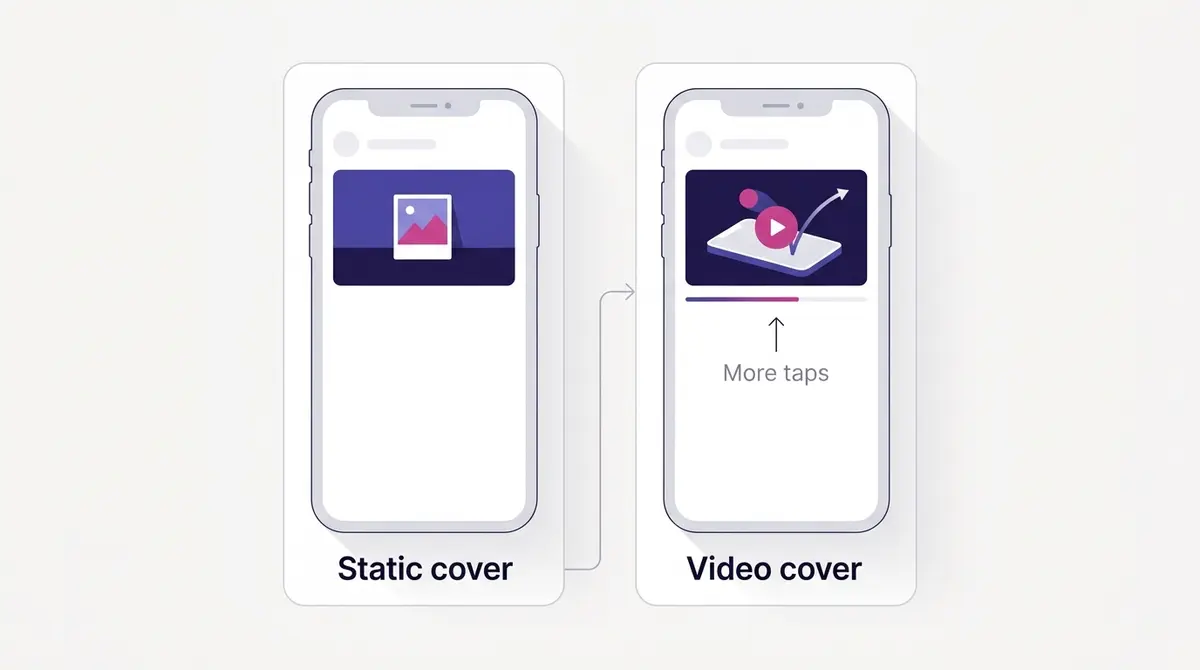
So the cover follows the same discipline as any strong single asset: lead with the result, not the setup. Show the after, the product working, the moment that makes someone want the thing. The cover has to land on its own and pull the tap, which is why the best collection covers feel like a short, self-contained video ad sitting on top of a shelf.
A few cover patterns earn their tap again and again: a short routine or demo that shows the payoff in seconds, a slow pan across the range that hints at the breadth waiting below, a single hero product in motion with the grid carrying the rest, or a before-and-after that resolves on screen. None of these need a gimmick, just the strongest few seconds you have placed where the most eyes land.
Real ranges make this concrete. A beauty brand like Medicube can run a how-to demo cover that resolves into glass skin, then taps open a grid of the serum, cleanser, and moisturiser that produced it. A jewellery brand like Bene Jewellery leans on motion for a different reason: a slow pan across a worn necklace catches the sparkle a static photo flattens, and that glint earns the tap. A modestwear brand like Afabelle Hijab can use a short styling cover, a drape settling into place, to sell fabric movement a folded flatlay never shows, then let the grid carry the colourways. The pattern is the same across all three: the cover shows what a still image cannot, and the grid does the selling once curiosity is hooked.
When collection beats a carousel, a single video, or a catalog ad
Picking the format is the decision before the cover. Collection earns its place when you have a range to show and a storefront to open into, not a single hero offer: the cover sells the result, the grid sells the breadth, the Instant Experience closes the browse. If your message is one product and one claim, a single video or image is cheaper and isolates the variable, so reach for collection only when the catalogue is the point.
| Job | Strongest format |
|---|---|
| One product, one claim | Single video or image |
| A sequence told card by card | Carousel |
| A range or storefront behind one hero cover | Collection |
| Re-showing browsed products to past visitors | Collection with a catalog (Advantage+) |
The clearest signal you want collection is that you can name a strong cover and a set of products it should open into. When you cannot picture the grid, you do not have a collection ad, you have a single-asset ad wearing the wrong format.
The format people most often confuse with collection is the dynamic product ad, which Meta now calls the Advantage+ catalog ad. A collection ad is a single designed unit: your hero cover on top, you in control of the grid and Instant Experience behind it. A dynamic product ad is catalog-first, showing each viewer a personalised set of products from your feed, usually with no single hero cover. The two are not rivals: a collection ad can run the Advantage+ catalog variant so its grid is catalog-fed. Reach for plain collection when a strong cover and a curated browse carry the message, and lean on the dynamic product ad when per-person product selection is the whole point.
Collection also fits some categories far better than others. It rewards visual, range-led businesses where seeing several options in one frame drives the browse: fashion, beauty, home decor, travel, and electronics sit squarely in its wheelhouse. It fits poorly when there is nothing to browse: a single-service business, a one-product brand, or a lead-gen offer with no range behind it gets little from the grid and is better served by a single video or a carousel. If you can fill a shelf, collection earns its place.
The 2026 collection ad specs
Meta publishes the collection spec in its ads guide, and because these are Meta's own published requirements rather than a performance benchmark, you can take them at face value as the rules of the format. Build to them and the ad renders cleanly across placements; ignore them and Meta crops, compresses, or rejects the creative.
| Spec | Collection value |
|---|---|
| Cover minimum resolution | 1080 x 1080 px |
| Cover aspect ratio | 1.91:1 to 1:1 |
| Cover image max file size | 30 MB |
| Cover video max file size | 4 GB |
| Primary text | ~125 characters |
| Headline | ~40 characters |
| Products under cover (Feed) | 3 images |
| Landing destination | Instant Experience (required) |
A few of these deserve a sentence of their own. The 1080 x 1080 minimum is a floor, not a target: ship the highest-resolution master you have, because the cover is the asset doing the persuading. The 1.91:1 to 1:1 range runs anything from a wide landscape to a square, but square sits most comfortably in a mobile feed and gives the product thumbnails room below it. Keep the cover video short: a 4 GB ceiling is generous, but the format rewards a tight loop, not a long film, because the job is to earn a tap, not hold a watch.
Copy is tighter than teams expect. Roughly 125 characters of primary text and 40 of headline survive before truncation trims them, so front-load the meaning. There is a good reason to put more of your message inside the creative itself: the chrome around the ad (the footer, the surrounding labels) carries little persuasive weight and Meta changes it without notice, while the cover is the one element every viewer sees. Bake a clear brand cue and an offer into the asset itself rather than relying on the frame around it.
Where collection ads run
Collection is not a Feed-only format, and treating it as one leaves delivery on the table. It runs on Facebook Feed, Instagram Feed, and Instagram Stories, and it appears on mobile only. The placement changes the layout. On Feed, a square or near-square cover sits above three product tiles; in Stories, the same cover sits above only two, on a full-screen vertical surface that crowds the top and bottom edges with interface, so keep your branding and key product toward the centre. Meta lists the cover ratio at 1.91:1 to 1:1 across every placement, so you build one cover at spec rather than a separate vertical cut, and Meta composes it into each surface. Leave placements on Advantage+ (automatic) and that one build runs across the eligible surfaces while Meta shifts spend toward whatever delivers; the ad placements and automatic versus manual placements guides cover that trade-off.
Where the catalog fits, briefly
You can run a collection ad two ways. Hand-pick the products that fill the grid, which suits a small, curated set, or connect a product catalog and let the Advantage+ catalog variant auto-populate and personalise the grid per viewer. The catalog and its feed live in Commerce Manager and get set up there before you touch the creative, which the catalog setup guide covers in full. Either way the cover is the same job, and the cover is what wins or loses the ad.
Pick the right Instant Experience template
After the cover and the grid, the next real decision is which Instant Experience template the tap opens into, the one most builders skip past. Meta gives you a handful, each shaped for a different goal. Match the template to the action you are buying, not to whichever looks busiest.
| Template | What it does | Best when your goal is |
|---|---|---|
| Storefront | Opens on a lifestyle cover, then a product grid pulled from your catalog | Selling a range; ecommerce with many SKUs |
| Lookbook | Shows products inside lifestyle images with tappable tags that reveal price and a buy link | Styling sells the product: fashion, beauty, home |
| Customer acquisition | A focused screen with a strong call to action that sends people to sign up, subscribe, or buy | Driving one clear conversion or sign-up |
| Storytelling | An immersive, scrollable brand narrative before any hard sell | Awareness and consideration; introducing a brand |
The logic mirrors choosing an objective. Storefront earns its place when the job is to sell across a catalogue. Lookbook wins where the product needs context, a dress on a person or a lamp in a room, the tap on a tagged image revealing the price and a link. Customer acquisition strips the screen to one action for a sign-up or a single hero offer, and Storytelling is the awareness play, the slow build before any buy button.
One setting inside the template is worth knowing. When the grid is catalog-driven, Meta can order the products dynamically rather than in a fixed sequence you set, surfacing the items each viewer is most likely to engage with, so the system does the merchandising per person instead of you guessing the order once for everyone. A fuller product set gives it more room to work: practitioners commonly suggest keeping at least a few dozen items per set so dynamic ordering has real choice, though treat that as directional guidance, not a Meta rule.
Use collection to re-show browsed products
One of collection's strongest jobs is retargeting, and it is the play most teams underuse. When the grid is catalog-driven, you can point a collection ad at people who already browsed or added to cart and show them the exact products they looked at, with the cover pulling them back into the shop. The plumbing is the catalog you would set up anyway, plus a Meta Pixel and the Conversions API feeding the events, plus a Custom Audience built from site visitors or add-to-cart actions. Meta then matches each viewer to the products they engaged with, so the grid reads as a personalised reminder, not a generic shelf.
That splits collection into two clean jobs. A cold-audience collection ad introduces the range; a warm-audience one closes a browse someone already started, usually the cheaper conversion because the interest is already there. The mechanics live in the sibling guides on retargeting and custom audiences. The rule that governs the rest of this guide still holds: catalog or not, the cover has to earn the tap before any of the personalisation behind it gets a turn.
What collection ads cost to run in 2026
The collection format pays the same auction price as any other. You are charged per impression or per result, never per product in the grid, so the format itself adds no media cost. What moves the number is the objective you choose. WordStream by LocaliQ's benchmark study is a clean neutral anchor: these are platform-wide Facebook averages across all formats and industries, not collection-specific figures, so treat them as expectation-setting, not a target your collection ad must hit.
| Objective | Metric | 2025 | 2024 |
|---|---|---|---|
| Traffic | Average CTR | 1.71% | 1.57% |
| Traffic | Average CPC | $0.70 | $0.77 |
| Leads | Conversion rate | 7.72% | 8.78% |
| Leads | Cost per lead | $27.66 | $21.98 |
Read the table for direction, not targets. Across 2025 the traffic click-through rate rose to 1.71% while the cost per click fell to $0.70, so clicks got more frequent and cheaper, while leads got pricier at $27.66 each. The lesson is not that collection ads are expensive or cheap. It is that cost follows the action you are buying. A traffic-objective collection running near a $0.70 CPC turns a few hundred dollars of test budget into roughly 500 clicks, enough delivery to learn whether the cover is earning taps. Judge a leads campaign on cost per lead, and read every number against your own account, not the global average.
The real cost of a collection ad is not media at all. It is production. The cover video, the product shots that fill the grid, the Instant Experience layout, that is design and shoot time, not ad spend. Which is exactly where the leverage is: a cheaper, faster way to produce a strong cover changes the economics of the format more than any bid setting.
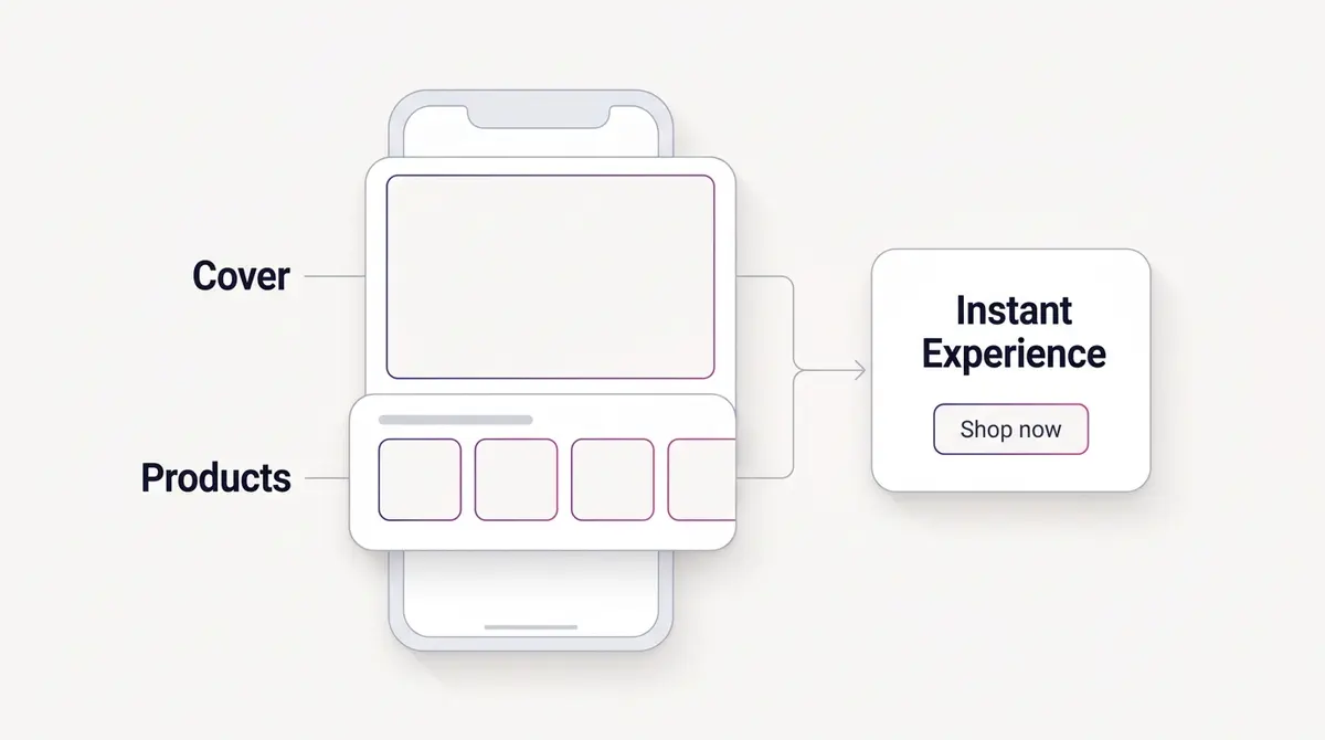
Read across that flow and the priorities sort themselves. The cover is the only part every viewer sees, so it earns the most production attention; the three Feed thumbnails preview the shop, so they show your strongest sellers; the Instant Experience holds the browse, so it has to feel like a real store.
Building and launching a collection ad
The collection choice happens at the ad level, after the campaign and ad set are set up. If those layers are unfamiliar ground, the full walkthrough of running a Facebook ad covers them. The collection-specific steps, in today's Ads Manager, go like this:
- Create a campaign and choose the objective. Sales fits most ecommerce collections; Traffic and Leads work when the job is a click or a form.
- Set the ad set as usual: budget, audience, placements. Leaving placements automated lets one build run across Facebook and Instagram feeds.
- At the ad level, select your Page, then open Ad creative. In today's Ads Manager the collection layout is set through Format display options at the creative step, so configure it there rather than hunting for it in the top-level format list.
- Upload your cover. A cover video at the specs above earns more taps than a static image in most cases, so lead with motion if you have it. Confirm the cover sits between 1.91:1 and 1:1 and clears 1080 x 1080.
- Set the product grid. Hand-pick the products, or connect a catalog so the Advantage+ catalog variant fills the grid from your feed. The three visible products on Feed should be your strongest, since they preview the shop.
- Build or pick the Instant Experience template that opens on tap, the required full-screen destination where people browse and buy.
- Write the primary text (about 125 characters) and headline (about 40), and make the brand and offer clear inside the cover and copy, since that is what every viewer sees regardless of the chrome around the ad.
- Preview the placements, mobile first since that is where the impressions land, then publish for review.
The pre-flight checklist is shorter than a carousel's, but the discipline is the same. Confirm Page and ad-account access, a finished cover at spec, the products selected, the Instant Experience built, and your measurement (a Meta Pixel plus the Conversions API) in place before you publish, so Meta optimises on real events and your report can tell a winning cover from a lucky one.
Common mistakes that flatten a collection ad
A few errors show up again and again, and all of them are avoidable before you publish:
- A low-resolution cover. Ship below 1080 x 1080, or upload a soft master, and it reads as low quality on a sharp phone screen before the grid ever loads.
- Treating the cover as a banner. A logo and a tagline explain the range; they do not earn a tap. The cover has to land like a short, self-contained ad on its own.
- Choosing the Advantage+ catalog variant with no catalog. The catalog-driven build needs a product feed set up in Commerce Manager first. Reach for it without one and you hit a wall. Hand-pick the grid instead, or set up the catalog before you build.
- Mismatching the template to the goal. A Storytelling template on a Sales campaign buries the buy action, and a Storefront on an awareness play asks for a purchase too early.
- Ignoring the Stories surface. Stories shows only two product tiles and crowds the top and bottom edges with interface, so a cover with its branding or key product pushed to an edge gets buried. The cover ratio is the same 1.91:1 to 1:1 as on Feed, so keep the brand cue and hero product toward the centre and the asset reads cleanly when Meta composes it into the full-screen vertical surface.
What to measure once the ad is live
A collection ad has more moving parts than a single image, so one number cannot tell you whether it worked. Read it as a funnel and watch where it leaks, because each metric points at a different part of the ad.
| Signal | What it reads | What a weak number means |
|---|---|---|
| Link or outbound CTR | Did people tap the ad at all | The cover is not earning the tap |
| Instant Experience open rate | Of those who saw it, how many opened the full screen | The cover's pull is soft |
| Time spent and product clicks inside | Are people browsing once inside | The grid or the template is the weak link, not the cover |
| Cost per result (CPA) and ROAS | Whether the ad pays, against your margin | The economics, not the creative, need a look |
| Average order value | Whether browsing a range lifts basket size | Collection's main edge is not landing |
Read these together and the diagnosis writes itself. A strong CTR with weak in-experience engagement means the cover wrote a cheque the grid could not cash: people tapped, then found nothing worth browsing. A weak CTR means the cover never earned the tap in the first place, so nothing behind it matters yet. Average order value is the metric many teams forget, and it is often where collection quietly wins, because a shopper who browses a shelf buys more than one who sees a single item. Fix the part the data points at, not the part you assume is broken.
Produce the cover, then launch it
Strip the format back and the work is clear. A collection ad is one strong cover, ideally a short video, over three of your best products, opening into a full-screen shop. The specs are fixed, the catalog is Meta-side plumbing, and everything that decides the outcome is the cover, which is a production problem: a few seconds of the product in motion, on brand, at spec, made fast enough to test more than one.
That is the part worth getting efficient at. A platform like AdPlay.ai generates on-brand cover creative and ad copy from a saved brand kit, then lets you refine the asset in the editor and launch straight to Facebook and Instagram, so you can ship a tappable cover video without a full shoot for every test, though the approach holds with any workflow. If you want to pressure-test whether motion is the right call for your product before you build, the static versus video comparison lays out when each wins.
Then run it the way the format rewards. Build one tight cover video, put your three best sellers under it, point it at a clean Instant Experience, and publish. A week in, read the funnel and fix the part the numbers point at, the cover first whenever the tap is missing, because the grid never gets a turn until the cover has done its job.
Example ad angles
Representative hooks and formats from the category.
“How-to or Demo ad for a glass-skin routine that taps open a shoppable grid”
“Showcase ad for the sparkle a static photo cannot catch in motion”
“How-to or Demo ad for a try-on that sells fabric movement before the grid”
By the numbers
Frequently asked questions
What is a Facebook collection ad?
A collection ad is a mobile-only format that shows a single cover (an image or a video) above a grid of products. It runs on Facebook Feed, Instagram Feed, and Instagram Stories: three product images sit under the cover on Feed and two in Stories. When someone taps the ad, a full-screen Instant Experience opens inside the app, where they browse and tap through to buy. It is built for ranges and storefronts, not single hero offers, and the Instant Experience landing page is mandatory.
Is the cover a video or an image, and which performs better?
It can be either. Meta accepts both for the cover, but ad guides consistently point to motion: Instapage and others report cover videos can lift interaction by up to roughly 20% over a static cover. Treat that exact figure as directional rather than a hard benchmark, because it is repeated in vendor guides without independent attribution. The underlying logic is sound: a feed rewards movement, and a few seconds of the product in use earns the tap into the grid better than a flat photo.
What are the exact specs for a collection ad cover in 2026?
Per Meta's current ads guide, the cover should be at least 1080 x 1080 pixels, with an aspect ratio between 1.91:1 and 1:1, and that range is the same whether the ad runs on Feed or in Stories. Cover images upload up to 30 MB and cover videos up to 4 GB (JPG or PNG for images, MP4 or MOV for video). Primary text runs to about 125 characters and the headline to about 40 before truncation. Three product images sit under the cover on Feed (two in Stories), and the ad must point to an Instant Experience.
Do I need a product catalog to run a collection ad?
Not always. You can hand-pick the products that fill the grid without a catalog, which suits a small, curated set. A catalog is what unlocks the Advantage+ catalog variant, where Meta auto-populates the grid from a product feed and personalises it per viewer. The catalog and feed live in Commerce Manager on Meta's side; you set those up there first, then build the creative cover. The cover asset is the same work either way.
Where do I find the collection format in Ads Manager now?
Look under Ad creative. In today's Ads Manager the collection layout is configured through Format display options at the ad-creative step rather than chosen from the top-level format list, so that is where to set it up. It did not disappear, it just lives in a different part of the flow. Whichever way you build it, put your branding and offer inside the cover and copy rather than leaning on the chrome around the ad, because the cover is the part every viewer sees.
What is the difference between a collection ad and a dynamic product ad?
They overlap but answer different questions. A collection ad is one creative unit: a hero cover (ideally a video) over a product grid that opens into a full-screen Instant Experience. A dynamic product ad, which Meta now calls an Advantage+ catalog ad, shows each viewer a personalised set of products pulled from your catalog, usually without a single hero cover, and is built to re-show items people browsed. The two can combine: a collection ad can run the Advantage+ catalog variant so its grid is catalog-driven and personalised. Reach for collection when a strong cover and a curated browse are the point, and lean on a catalog ad when automated, per-person product selection is. Our dynamic product ads guide covers the catalog side in full.
What should I expect a collection ad to cost?
You pay the standard auction price per impression or per result, never per product in the grid. Cost tracks your objective, not the format. In 2025, WordStream by LocaliQ put the all-industry Facebook traffic CPC at $0.70 with a 1.71% CTR, and a leads campaign at a 7.72% conversion rate and a $27.66 cost per lead. Those are platform-wide averages across formats, not collection-specific numbers, so use them as expectation-setting, not a target your collection ad must hit.
How do I measure a collection ad's performance?
Read it as a funnel, not a single number. Link or outbound CTR tells you whether the cover earned the tap. The Instant Experience open rate, plus time spent and product clicks inside it, tell you whether the grid and template held attention once people were in. Cost per result and ROAS decide whether it pays, and average order value often rises on collection because people browse a range rather than buy one item. Watching these together shows which part to fix: a high CTR with low in-experience engagement means the cover oversold what the grid delivered, while a low CTR means the cover never earned the tap in the first place.
Sources
- 1.Meta, Collection ad specs (official Ads Guide) (2026)
- 2.Meta, Design specifications for collection ads (Business Help Centre) (2026)
- 3.WordStream by LocaliQ, Facebook Ads Benchmarks 2025 (2025)
- 4.WordStream by LocaliQ, Facebook Ads Benchmarks 2024 (2024)
- 5.Instapage, The Complete Facebook Collection Ads Guide (2025)
- 6.ATTN Agency, Meta Instant Experience Ads optimization guide (2026)
- 7.Meta, Supported objectives and placement options for collection ads (Business Help Centre) (2026)
- 8.Meta, About Instant Experience templates (Business Help Centre) (2026)
- 9.Meta, Choose products to show in a collection ad (Business Help Centre) (2026)
- 10.Meta, Collection ad specs on Instagram Feed (Ads Guide) (2026)
- 11.Meta, Collection ad specs on Instagram Stories (Ads Guide) (2026)
- 12.Jon Loomer, Format Display Options for Carousels and Collections (2025)
Keep exploring
Turn ad research into winning ads
Research the ads that work, generate the creative on-brand, and launch to Meta, all in one tool.
7-day free trial · No credit card required