
Carousel vs Single Image Ads (2026)
When a Facebook carousel beats a single image and when it does not, by objective and offer, plus how to test both for the same offer and read cost per result.
Updated October 2026 · Likit Sae Lee, CTO

There is no universal winner. A carousel wins when the message has parts: a product range, a step-by-step demo, a before-and-after, or a story told across cards, where Meta's own 2015 benchmark put carousel link ads at 30-50% lower cost per conversion than single-image link ads. A single image wins for one punchy message, a fast and cheap hook test, a tight budget, or a placement where a multi-card unit renders awkwardly. The right move is to run both against the same objective, audience, and offer, then judge on cost per result, not click-through rate, because a swiped carousel inflates engagement without always lowering the cost of a conversion.
You have one offer and two ways to show it: a single image that says one thing fast, or a carousel that fans the message across 2-10 swipeable cards. The instinct is to ask which format converts better, but that is the wrong question, because the answer changes with the objective, the funnel stage, and the offer itself. This guide crosses format choice with all three, gives you an offer-by-offer recommendation, and lays out a fair head-to-head so cost per result, not a vendor stat, settles it for your account.
There is no universal winner, only a winner per offer
Ask which converts better, a carousel or a single image, and the honest answer is the one nobody wants: it depends on the offer. Both are static formats. Both win auctions every day. The difference is not motion or production pipeline (that is the static vs video question), it is message structure. A single image carries one idea. A carousel carries a message that has parts, fanned across 2-10 swipeable cards. So the format choice is really a question about your message: does it have parts, or does it have one thing to say.
That reframing kills most of the bad advice you will read. The pages that declare "carousels convert better" are quoting a real but narrow finding and stripping the context off it. The pages that say "single images are dead" are ignoring how much of direct response runs on one clear frame. The teams that actually scale do neither. They pick the format that fits the message, run both against the same goal when the offer could go either way, and let cost per result decide. The rest of this guide gives you the decision rules first, then the fair test that settles the close calls.

One number is worth putting on the table now, because you have seen it everywhere and it deserves honest handling. Facebook's 2015 developer blog reported that carousel link ads drove 30-50% lower cost per conversion and 20-30% lower cost per click than single-image link ads. That is the original source of every "carousels win" claim you will read, and it is worth quoting precisely, because the framing matters more than the digits. It is Meta's own directional benchmark, posted when the format extended to mobile app ads, not an independent study, and it averages across advertisers who used the carousel where it fit. Treat it as a reason the format can earn its keep when the message splits into cards, not a guarantee that five cards always beat one frame. The inflated multipliers that float around vendor pages (a fixed conversion percentage, a specific return-on-ad-spend gap, a tenfold click-through rate) trace to tool marketing and do not survive a fact-check, so this guide leans only on Meta's directional figure and on the neutral cost benchmarks below.
The decision, by objective and funnel stage
Format choice gets sharper the moment you cross it with what the campaign is actually for. A single image and a carousel pull their weight in different places along the funnel, so map the choice to the objective and the stage before you map it to the creative.
At the top of the funnel, cold awareness and traffic, you usually want one of two things: a cheap read on a new hook, or a story with room to breathe. A single image is the better hook test, because it isolates one idea and ships in minutes, so a result tells you whether the hook works rather than which of several cards did. When the awareness play is a narrative (how the brand started, why the product exists, a transformation worth setting up), a sequential carousel earns the attention a single frame cannot. Lead with the single image to learn, reach for the story carousel only when you have an angle worth telling at length.
In the middle of the funnel, consideration, the buyer is comparing and wants detail. This is where the carousel is most often the right answer. A feature tour gives one product several cards (the material, the fit, the detail shot, the lifestyle frame), a how-to walks the steps in order, and a before-and-after spreads a transformation across cards so the change reads in sequence instead of in a cramped split frame. A single image can still carry a sharp consideration message, but when the proof needs unpacking, cards do it better.
At the bottom of the funnel, retargeting and sales, it forks cleanly. For a warm audience that already knows the offer, a single-image reminder (the price, the deadline, one call to action) closes fast and costs almost nothing to produce. For shoppers who browsed specific products, a catalog carousel that rebuilds its cards from your product feed shows each person the exact items they looked at, which a single image cannot personalise. So the bottom of the funnel runs single images for offer reminders and dynamic carousels for browsed-item retargeting.
| Objective and stage | Lead with | Why |
|---|---|---|
| Cold awareness, testing a new hook | Single image | Isolates one idea, ships fast, gives a clean read on whether the hook works |
| Cold awareness, a story worth telling | Carousel (sequential) | A narrative unfolds across cards in a way one frame cannot |
| Consideration, a feature tour or demo | Carousel | One angle or step per card, in order |
| Consideration, a before-and-after | Carousel (sequence) | The transformation reads across cards, not in a split frame |
| Retargeting a warm offer | Single image | One price, one deadline, one call to action, read in a second |
| Retargeting browsed or abandoned items | Carousel (catalog) | Shows each viewer the exact products they looked at |
The decision, by offer
Objective tells you the stage; the offer itself often decides the format outright. Here the question is simpler: does the offer have parts. A single hero discount or a launch announcement is one idea, so it belongs in one frame, concentrated and loud. A product range or collection is many ideas, so each gets a card and its own destination link, and the ad works like a shelf the shopper swipes. A multi-step demo or recipe is a sequence, so one step per card keeps the order intact. A before-and-after transformation is two states with a story between them, which reads far better swiped than squeezed into a split image. One punchy emotional message (a single claim, a single feeling) is one idea again, so it goes in a single image where nothing competes with it. And retargeting browsed SKUs is a personalisation problem, which only a catalog carousel solves.
| The offer you have | Better format | Why |
|---|---|---|
| A single hero discount or launch | Single image | One idea, concentrated in one loud frame |
| A product range or collection | Carousel | One card per product, each with its own link |
| A multi-step demo or recipe | Carousel (fixed order) | One step per card keeps the sequence intact |
| A before-and-after transformation | Carousel (sequence) | The change reads across cards, not in a split frame |
| One punchy emotional message | Single image | Nothing competes with the single claim or feeling |
| Retargeting browsed or abandoned SKUs | Carousel (catalog) | Personalises the cards to each shopper from the feed |
Real ad examples make the split concrete. A hijab label runs the shelf version, a showcase carousel giving four scarf styles a card each, picked for one outfit, so the shopper swipes the rack. A gym brand runs the transformation version, a before-and-after carousel that opens on an empty room and ends on a fully equipped gym, where the swipe is the story. And a furniture seller runs the single-image version, one frame carrying a full bedroom set with instalment terms, a single offer that needs no swipe and would only be diluted by one. Three offers, three correct formats. The carousel did not win or lose on principle; it fit two messages and would have hurt the third.
If you have decided a carousel is the answer and want the card-by-card specs, the pre-flight checklist, and the build steps in Ads Manager, the full carousel build walkthrough covers all of it. This page stays on the decision, so the only specs worth repeating here are the ones that bear on the choice: a carousel holds 2-10 cards (Meta's 2026 spec), and 3-5 is the practical sweet spot, because everyone sees card one but only a fraction swipe deeper.
The production trade-off is a real deciding factor
The cleanest reason to pick a single image has nothing to do with conversion theory. It is production economics. A single image is one creative: one frame, one headline, one call to action, designed and shipped in minutes. A carousel is effectively 3-10 finished, matched creatives plus per-card copy, per-card headlines, and a separate destination URL (with its own tracking parameter) for each card. That is not a footnote. It is a multiplier on the time it takes to get an ad live, and it shapes how fast you can learn.
That multiplier is exactly why a single image is the right call for fast hook tests. When you are still discovering what resonates, you want to run many angles cheaply and read each one cleanly. Five single images cost roughly what one carousel costs to produce, and each isolates a single hook, so a week of testing teaches you five things instead of one. The carousel's production cost only pays off once you know which message deserves the extra cards. Spend the design hours building a ten-card unit around an untested idea and you have gambled your whole production budget on a guess.
It is worth being precise about what does not change between the formats: the media cost. You pay the auction price per impression or per result, never per card, so running a carousel costs the same in ad spend as running a single image. The objective sets that price, not the format. In 2025, a Facebook traffic campaign averaged a $0.70 cost per click at a 1.71% click-through rate, while a lead campaign averaged $1.92 per click at a 2.59% click-through rate and a $27.66 cost per lead, per WordStream and LocaliQ. Search Engine Land noted that the lead cost climbed 21% year over year, even as the traffic cost per click fell. None of that moved because of the format. So when you weigh a carousel against a single image, the cost difference to budget for is design time, not media.
The metric trap: engagement is not the verdict
Here is the trap that makes carousels look like they always win. A carousel earns extra engagement from the format itself. Every swipe registers, every per-card click counts, so a carousel routinely shows a higher click-through rate than a single image pitching the same offer. Read that number naively and the carousel looks like the obvious winner. Read it carefully and you notice the single image may have delivered the cheaper conversion while the carousel collected the busier dashboard.
This is the same lesson as the static vs video comparison, re-derived for swipe behaviour: the format that earns more taps is not automatically the format that earns more sales. Click-through rate flatters whichever unit is more tappable, and a carousel is built to be tapped and swiped. The metric that pays the bills is cost per result, the actual purchase or lead, divided by what you spent to get it. A carousel that wins on click-through rate and loses on cost per result is not winning. Judge on the number that maps to revenue, and treat the engagement lift as a diagnostic clue, not the scoreboard.
There is one engagement read a carousel offers that a single image cannot, and it is genuinely useful: the per-card breakdown. Ads Manager shows impressions, clicks, and results card by card, so you can see exactly which card carried the ad and which died on the third swipe. That tells you what to keep and what to cut inside the unit. But it measures within one ad. It does not answer the bigger question of whether a carousel was the right format at all. For that you need a clean test against a single image.
How to test both for the same offer
When the offer could plausibly go either way, do not pick on instinct. Run a fair head-to-head and let the result decide. A fair test holds everything constant except the format.
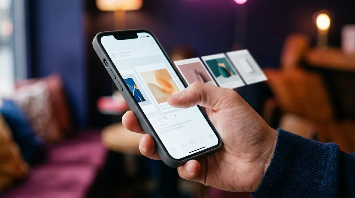
Set both ads to the same objective, the same audience, and the same landing logic, and keep the core offer identical, so a single image pitching "20% off the bestseller" runs against a carousel built around that same promise. The only variable left is single image versus carousel. Give each one enough budget and enough time to exit the learning phase and produce a stable cost per result, usually a few days and as many conversions as your spend allows, because judging on the first afternoon reads noise as signal. The Facebook ad creative testing guide covers how to structure these splits so the result is trustworthy rather than a coin flip.
Then read the result on two layers. The top-line answer is cost per result: whichever format delivers your actual goal (the purchase, the lead, the sale) at the lower cost wins that round, full stop, regardless of which one looked busier on click-through rate. The second layer is the carousel's per-card breakdown, which tells you which cards earned their place if the carousel won, or which single message you should isolate into a cheaper single image if it lost. One read settles the format; the other tells you what to build next.
| Step | Hold constant | What to read |
|---|---|---|
| Build | Objective, audience, landing logic, core offer | Nothing yet |
| Launch | Same budget per format | Learning-phase exit |
| Read | All of the above | Cost per result, not click-through rate |
| Diagnose | The winning format | Per-card breakdown (carousel only) |
This is also where the production point pays off in practice rather than theory. The friction in running this test is building a matched multi-card set as quickly as you build one single image, so testing both for the same offer does not cost a week of design. An on-brand generator like AdPlay.ai builds matched image variations and ad copy from a saved brand kit, which is what makes the head-to-head cheap enough to run on every offer worth the spend rather than only on the big launches.
When a single image is the smarter spend
The case for the single image deserves its own section, because pro-carousel writing tends to bury it. A single image is not a fallback, it is the right answer for a specific and common set of jobs, and choosing it deliberately is a sign you understand the format, not that you settled.
Pick the single image on a tight budget. Five cards split your delivery five ways in production effort, and a small budget spread thin gives no single message enough room to learn. One frame concentrates everything. Pick it for a brand-new, untested hook, because it isolates the variable so a clean win or loss tells you about the hook itself, not about a confound of message, format, and card count all changing at once. Pick it when the offer is genuinely one thing: one product, one promise, one price, where a carousel would only repeat the message at several times the cost. Pick it for fast iteration, when the plan is to run many angles this week and keep the winners, since one image ships in minutes and a carousel does not. And pick it for a placement where a multi-card unit renders awkwardly: a single image runs cleanly across nearly every surface, while a carousel lives most naturally in the feed and reads less well on the full-screen vertical placements where attention increasingly sits. If the offer would be stronger in motion than in a still frame, that is a different fork entirely, and the static vs video comparison is the one to read.
The deeper argument under all of those is isolation. A single image cleanly A/B tests one thing, so when it wins or loses, the result is readable. A carousel changes the message, the format, and the card count at the same time, which confounds the read. That makes the single image the better instrument when you are still learning what works, and the carousel the better instrument once you know the angle and want it to do more. There is a one-line aside worth knowing here too: if the offer is really a storefront to open into rather than a set of cards to swipe, collection ads own that comparison, and the choice shifts again.
Do not pick one forever: scout, then scale
The strongest move is not to crown a permanent winner. It is to run the two formats as a sequence. Use the cheap single image to discover the angle, then build the carousel that lets the proven angle do more.
The pattern looks like this. Scout with single images, several angles in a week, each isolating one hook so the read is clean, judged on cost per result. The single image is your scout, the same way a static scouts for video in the other comparison. Once an angle wins, ask whether it has parts worth unfolding. If the winning message is a range, a sequence, or a transformation, promote it into a carousel that gives those parts their own cards, and run the carousel against the proven single image on the same offer to confirm the upgrade actually lowers cost per result rather than just lifting click-through rate. If the winning message is genuinely one idea, leave it as a single image, because there is nothing to fan across cards, and refresh it before it fatigues. Either way, you have spent the expensive production only on an angle that already earned it. If you want to sharpen the hook that all of this rides on, the Facebook ad hooks guide breaks down opening patterns you can brief into either format, and the full guide to running a Facebook ad sets the campaign structure underneath both.
Carousel against single image is not a fixed contest with a permanent champion. It is a portfolio you run by objective, by funnel stage, and by offer, scouting cheap with one frame and scaling the winners into cards when the message has parts to show. Match the format to the message, test both for the offers that could go either way, and let cost per result, not the busiest dashboard, decide which one earns the next dollar.
By the numbers
Frequently asked questions
Do carousel ads actually convert better than single image ads?
Sometimes, and the famous number is Meta's own. Facebook's 2015 developer blog reported carousel link ads driving 30-50% lower cost per conversion and 20-30% lower cost per click than single-image link ads. Read it for what it is: Meta's own directional benchmark, not an independent study, averaged across advertisers who used the format where it fit. The win is real when the message genuinely splits into cards (a product range, a sequence, a before-and-after), because each card does work and people who swipe self-qualify. For one hero offer or a brand-new hook, a single image is cheaper to make, isolates the variable, and is usually the better call. Match the format to the job and the cost edge tends to follow.
When should I use a single image ad instead of a carousel?
Use a single image when the ad has one idea: a single discount, a launch date, one hero product on one promise, or one emotional message. Use it when you are testing a brand-new hook and want a clean, cheap read on whether the idea works. Use it on a tight budget, where spreading spend across five cards leaves none of them enough delivery. And use it when you want fast iteration, since one image ships in minutes while a carousel needs 3-10 matched creatives plus per-card copy. If the message does not have parts, a carousel just repeats one idea at several times the production cost.
Is a carousel or a single image cheaper to run on Facebook?
They cost the same to run, because you pay the auction price per impression or per result, never per card. The objective sets the price, not the format: in 2025 a traffic campaign averaged a $0.70 cost per click while a lead campaign averaged $1.92 per click and a $27.66 cost per lead, per WordStream and LocaliQ. Where the two formats genuinely differ is production. A single image is one creative; a carousel is effectively 3-10 finished, matched creatives plus per-card copy and destination links. So the line item that grows with a carousel is design time, not media spend.
Should I test a carousel against a single image for the same offer, and how?
Yes, and the test only means something if it is fair. Hold everything constant except the format: same objective, same audience, same landing logic, same core offer, so the only variable is single image versus carousel. Give each enough budget and time to exit the learning phase and produce a stable number, usually a few days and as many conversions as your spend allows. Then read cost per result, not click-through rate, because a carousel earns extra engagement from the swipe itself. On the carousel, also open the per-card breakdown to see which cards carried it, which tells you what to promote next.
Does a carousel get more clicks than a single image, and does that matter?
A carousel often shows a higher click-through rate, partly because swipes and per-card clicks inflate the engagement count, so the format can look like it is winning while a single image quietly delivers the cheaper conversion. That is the metric trap. Click-through rate flatters whichever format earns more taps, but taps that do not convert do not pay. Judge both formats on cost per result, the actual purchase, lead, or sale, and treat a high carousel click rate as a diagnostic signal, not the verdict.
Which format is better for retargeting, a carousel or a single image?
It depends on what you are retargeting. For a warm audience that already knows the offer, a single-image reminder carrying the price, the deadline, and one clear call to action works fast and costs almost nothing to make. For shoppers who browsed specific products, a catalog (Advantage+) carousel that rebuilds its cards from your product feed shows each person the exact items they looked at, which a single image cannot personalise. So a hand-built single image suits an offer reminder, while a dynamic catalog carousel suits re-showing browsed or abandoned-cart items at scale.
Which format is better for cold awareness or testing a new hook?
For testing a new hook cheaply, lead with a single image. It isolates one variable, so a clean result tells you whether the hook itself works rather than leaving you guessing which of several cards did the job. It also ships fast and cheap, so you can run several angles for the cost of one carousel. For cold awareness where the story needs room, a sequential carousel that unfolds a narrative across cards can earn attention a single frame cannot, but only commit the extra production once you have a hook worth telling at length.
Is the 30-50% lower cost per conversion claim for carousels true?
It is a real published figure, but it is Meta's own and it is directional. The 30-50% lower cost per conversion and 20-30% lower cost per click come from Facebook's 2015 developer blog, posted when the format extended to mobile app ads, and they average across advertisers who used the carousel where it fit. It is not an independent study, and it is not a guarantee that wrapping any ad in five cards halves your cost. Ignore the inflated multipliers that circulate on vendor pages (claims like a fixed 20% conversion lift, a specific ROAS gap, or 10x click-through rate); the only durable, sourceable number is Meta's directional 30-50%, and even that holds only when the message belongs in cards.
Sources
- 1.Meta for Developers, Announcing Carousel Format for Mobile App Ads (2015)
- 2.Meta Ads Guide, Carousel Ad Specs (2026)
- 3.WordStream, Facebook Ads Benchmarks 2025 (2025)
- 4.LocaliQ, Facebook Advertising Benchmarks 2025 (2025)
- 5.Search Engine Land, Facebook Ad Costs Jump 21% in 2025 (2025)
- 6.Meta Business Help Center, Show the Best-Performing Cards in a Carousel Ad (2026)
- 7.Social Media Today, Advantage+ Catalog Targeting Update (2025)
Keep exploring
Turn ad research into winning ads
Research the ads that work, generate the creative on-brand, and launch to Meta, all in one tool.
7-day free trial · No credit card required