
Why UGC Ads Look Fake (and How to Fix It)
The tells that make UGC ads read as fake or scripted, over-lit, over-produced, actor-y, mismatched, and the specific fix for each, for a natural, high-stopping cut.
Updated November 2026 · Xanny Lee, CEO
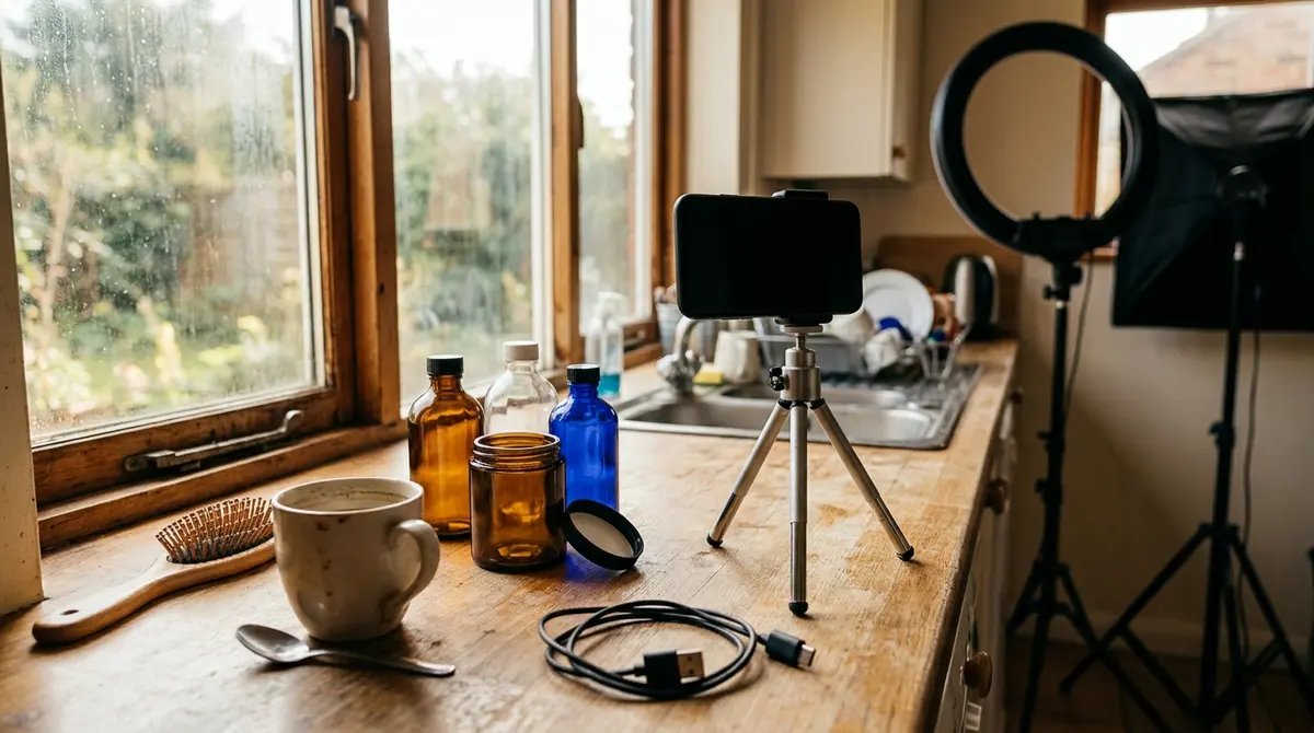
UGC ads look fake when the production fights the format: studio lighting, an actor-y read, a scripted 'hey guys' hook, props too perfect for the setting, and a result too clean to believe. Each tell breaks the one thing UGC trades on, the sense that a real person is talking, which is why 92% of people still trust a recommendation from someone they know over any ad format (Nielsen, 2012). The fix is not more polish but less: shoot vertical on a phone in real light, let the creator use their own words, open mid-action on a real problem, and show honest, captioned proof so it lands on mute, the way 69% of people watch video in public (Verizon Media and Publicis Media, 2019).
You paid a creator, briefed the beats, and the finished cut still feels like an ad wearing a hoodie. Something in it reads as staged, the thumb keeps moving, and the stop rate never climbs. UGC is supposed to borrow the trust of a friend's recommendation, but a short list of production tells quietly hands that trust back. This guide names the tells that make a UGC ad look fake or scripted, and the specific fix for each, so the cut reads as a real person and holds attention long enough to sell.
The trust you are actually spending
A UGC ad is a borrowed voice. It works because it looks like the clip a friend sent you, not the spot a brand paid for, and that resemblance is the whole asset. Nielsen's global study found that 92% of people trust a recommendation from someone they know, and 70% trust opinions posted online by other consumers, higher than any paid-ad format (Nielsen, 2012). A UGC ad rents a slice of that trust. The moment the viewer senses a brand behind the camera, the rent comes due and the ad performs like any other interruption in the feed.
That is what a fake tell actually costs you, and it is not a matter of taste. Each tell is a signal that flips the viewer from "a person is talking to me" to "this is an ad," and the switch happens fast. Attention research from Amplified Intelligence, covered by The Media Leader, suggests as little as roughly 1.5 seconds of active attention can be enough to register an ad when a brand leans on distinctive assets (a directional figure, and one contingent on those assets being present). You do not get a warm-up. The first frames either read as real or they do not, and a single production tell in those frames can settle the question before a word is heard.
Consumers are also actively hunting for the real version. Sprout Social's Index has repeatedly found authenticity at the top of what people say they do not see enough of from brands on social, and its later editions rank authenticity and relatability among the traits consumers value most in brand content. The bar has moved. Audiences are less impressed by polish and more suspicious of it, so a cut that looks expensive can work against you, because expense is exactly what a real person's phone video does not have.
Put a number on the waste. At a blended Meta CPM of about $8.19 (Gupta Media, 2025), a $1,000 test buys roughly 122,000 impressions. Suppose a slick, staged cut stops 8% of the people who see it in the first seconds, while a native cut of the same offer stops 14%. Those percentages are illustrative rather than published, but the shape is real: six points of stop rate on the same spend is about 7,300 more people who actually watch the ad, for the same money. The creative decides that gap, not the budget. Analysis by NCSolutions found the creative itself drives about 49% of short-term incremental sales lift, the single largest factor ahead of targeting and reach (NCSolutions via Marketing Charts, 2023). A fake-looking UGC ad throws away the lever that matters most.
The tells at a glance: what reads as fake and how to fix it
Most "this feels fake" reactions trace to a short list of production tells. None of them is about the product or the offer. They are all about the gap between how the clip was made and how a real person's clip looks. The table below is the diagnostic: find the tell that matches your cut, and the fix column names the change. The sections after it work through each one in detail.
| Tell | Why it reads as fake | The fix |
|---|---|---|
| Studio lighting and heavy colour grading | Real life is lit by a window, not a softbox | Shoot near available light and keep one honest shadow |
| Actor-y, salesy delivery | It sounds like reading, not talking | Brief beats, not a script, and use the creator's own words |
| A scripted "hey guys" open | It signals an ad before the point arrives | Start mid-action on a real problem |
| A staged setting and too-perfect props | Nothing in frame looks lived-in | Film in a real room and leave the clutter |
| A flawless before-and-after | A result too clean reads as edited | Same light, same angle, no filter, and say so |
| A landscape crop with no captions | It was cut for another screen, not a muted phone | Native vertical 9:16 with burned-in captions |
Two things about this list. First, the tells compound: a studio light, an actor, and a scripted open in the same three seconds read as fake three times over, and the viewer only needs one to decide. Second, every fix makes the ad cheaper to produce, not more expensive. Authenticity is the rare quality in advertising that you buy by spending less.
Over-lit and over-produced: when the polish gives it away
The fastest tell is light. A real person films themselves by a window, under a kitchen bulb, or in a car with the sun coming through the windscreen. The light is uneven, a little too warm or too cool, with a shadow on one side of the face. A production sets up a key light, a fill, and a rim, wraps the face in even soft light, and grades the footage to a filmic palette afterward. The result looks good, and "looks good" is the problem. Nobody's honest phone selfie looks like that, so the brain files it as content made to sell.
Ring lights are the clearest culprit. The circular catchlight in the eyes, the flat shadowless face, the slightly plasticky skin: all of it signals a creator performing for a camera rather than a customer sharing a find. Colour grading is the second offender. The moment footage has been pushed to a cinematic teal-and-orange look, it stops resembling something shot this morning and starts resembling something a team produced. Even the wrong lens gives it away, because a shallow, creamy background blur is a camera a real customer does not own.
The fix is to under-light on purpose. Put the creator near a real window and let the available light do the work, keeping one honest shadow on the face instead of erasing it. Skip the grade, or hold it to a light correction that looks like a phone's default. Let the white balance drift slightly toward the true colour of the room. If the footage looks like it could have been shot by the viewer's sister, it is lit correctly.
This is where "native beats polished" stops being a slogan and becomes a production note. The studio-versus-UGC comparison covers when a clean studio look is the right call, because it is not always wrong: a premium brand selling a considered purchase can want the polish. But for a UGC ad, whose entire job is to not look like an ad, the expensive lighting rig is the thing quietly telling on you. The cheaper setup is the more effective one, which is a rare and useful thing in advertising.
Actor-y delivery and the scripted hook
The next two tells you hear before you finish seeing them. The first is actor-y delivery: the creator is clearly reading. The cadence is even, the emphasis lands on the wrong words, the eyes flick to a teleprompter just off-camera, and the whole thing carries the bright, projected tone of someone performing rather than the flatter, faster rhythm of someone talking to a friend. Trained actors often make this worse, not better, because their instinct is to enunciate and sell, and selling is the exact register UGC is trying to escape.
The second is the scripted hook, and it is the single most common tell in the format. "Hey guys, so today I want to talk about a product I have been loving." That sentence announces an ad before it delivers a single reason to keep watching. It is a warm-up, and the format has no room for a warm-up. It also sounds nothing like how a person opens a real story, which starts in the middle: "I cannot believe I wasted two years on this."
Both tells come from the same mistake, handing the creator a paragraph to recite. The fix is to brief beats, not a script. Give the creator the shape of the story and the one or two lines that have to be exact (usually the hook and the call to action), then let them paraphrase the middle in their own words. The UGC ad script guide lays out that beat structure in full; the point here is that the words on the page should be a scaffold, not a teleprompter. A slightly clumsy real sentence outperforms a smooth scripted one, because the clumsiness is the proof of a person.
For delivery, cast for it. A creator who talks like your customer, filmed doing the thing they would actually say, beats a polished presenter every time, and the guide to finding UGC creators covers sourcing people who already sound right. When you record, capture more than you need and keep the take where the creator forgot the line and said it plainly, not the one where they nailed the script. For the hook, cut the warm-up entirely. Start on the problem, the result, or the product already in hand. "Hey guys" is three seconds you cannot afford, and it is three seconds spent confirming the viewer's suspicion. Open mid-action, on the face, with a real sentence, and the ad earns the next five seconds instead of asking for them.
The setting that does not match a real life
A setting tells on an ad as loudly as lighting does. The tell is a room that looks arranged: a bathroom with a single product placed label-forward on an empty shelf, a kitchen counter bare except for the thing being sold, a desk styled with a plant, a coffee, and the product at a perfect angle. Real rooms are cluttered. They hold other brands' bottles, a hairbrush, a phone charger, yesterday's mug. When every one of those has been cleared away to feature the product, the frame reads as a set, and a set reads as an ad.
New everything is the related tell. A product that is pristine, in packaging that has clearly never been opened before this take, in a room where nothing else looks used, signals a shoot rather than a life. The viewer does not consciously notice the missing wear, but they feel the staging, and feeling it is enough.
Props that contradict the story break it fastest. A creator says the product lives on their nightstand, but the frame is a styled studio corner. A supplement is "part of my morning," filmed in a space with no sign anyone actually lives there. The mismatch between what is said and what is shown is a small dishonesty, and small dishonesties are exactly what a skeptical audience is scanning for. Once they catch one, they reread the whole ad through it.
The fix is to film in a real room and leave the mess. Let the other brands stay on the shelf. Let the product look like it has been used, cap slightly off, a bit of wear on the label. Put it where it would genuinely live, and shoot from where the creator would actually hold the phone. The production walkthrough for UGC ads covers setting and framing in more depth, but the rule is simple: the frame should look like the creator picked up their phone in the middle of their day, not like a stylist dressed a table for a catalogue. A little chaos is credibility.
When the result looks too perfect to believe
Proof is where a UGC ad wins or loses belief, and it is also where the fake tell does the most damage, because a result the viewer does not believe is worse than no result at all. The tell is a before-and-after that is too clean. The "before" is unlit, unflattering, shot from below in bad light; the "after" is glowing, well lit, filtered, shot from the good angle. The transformation the viewer is being sold is at least partly a lighting and camera trick, and audiences have seen enough of these to spot the switch instantly. The moment they do, they discount not just the result but the whole ad.
Filters are the obvious version. A smoothing filter on the "after" shot does not read as better skin, it reads as a filter, and it converts a proof point into a red flag. Over-produced results in general trigger the same discount: a demo that works suspiciously perfectly, a testimonial delivered like a commercial, a number on screen with no source behind it. Each one asks the viewer to take a leap, and a skeptical viewer will not.
The fix is honesty made visible. Shoot the before and the after in the same light, from the same angle, with no filter, and say so on screen. "Same lighting, no filter" does more work than any superlative, because it pre-empts the exact suspicion the viewer is forming. Show the unglamorous version. A real result with a visible imperfection is more persuasive than a flawless one, because the flaw is the thing a staged ad would have removed. The social-proof guide breaks down which proof formats carry the most weight, but the through-line is credibility over polish: a slightly worse-looking honest result beats a better-looking one the viewer suspects.
This tell connects UGC to the wider problem of ads that look manufactured. A synthetic-looking result and an over-generated AI ad fail for the same reason, a mismatch between what is shown and what the viewer believes actually ships, which the guide to why AI-generated ads fail covers from the generation side. Whether the source is a filter or a model, the cure is the same: show the true thing, and let its imperfection vouch for it.
Format tells: landscape crops, missing captions, and the muted feed
Some tells have nothing to do with the acting and everything to do with the container. The most common is a landscape crop. A clip shot in 16:9 for a horizontal screen, then dropped into a vertical feed with black bars or a zoomed, cropped centre, announces that this footage was made for somewhere else and repurposed. Real phone video is shot vertically, full-frame, 9:16, because that is how a phone is held. A UGC ad that is not vertical is fighting the format before the content even starts.
The bigger tell is silence handled badly. Most of the feed is watched on mute. Verizon Media and Publicis Media's 2019 study of 5,616 US consumers found 69% watch video with the sound off in public places, and 80% say they are more likely to finish a video when captions are available. If your UGC ad carries its message only in the audio, most viewers get a silent person mouthing words at them, which is not a person sharing a find, it is a confusing clip they scroll past. A polished voiceover makes this worse, because a smooth VO is both a fake tell and useless on mute.
Meta's own guidance is to design for sound off and add captions so the message lands without audio, and Ads Manager will generate them or let you upload a caption file (Meta Business Help, Add Captions to Your Video Ad). Burned-in captions are the safer choice for a UGC ad, styled like the rough, slightly oversized captions a creator would add themselves, not a broadcast lower-third. The caption is also where your hook lives for the majority watching muted, so the first line has to be legible in the opening frames, not buried three lines down or timed to appear after the scroll decision is already made.
The fixes here are mechanical and cheap. Shoot vertical, full-frame, 9:16. Add captions in the creator's own casual style. Assume the sound is off and make the video work anyway, then treat any audio as a bonus for the minority who have it on. Get the container right and the content you laboured over in the other sections actually gets seen. Get it wrong and the best-acted, best-lit UGC ad in the world plays to a muted, cropped void.
Run an authenticity pass before you launch
Before a UGC ad goes live, run it through one honest question and a short checklist. The question: would a real person, who was not paid, actually post this? If any part of the cut answers no, that part is a tell, and the sections above name the fix.
Then the checklist, in the order the tells appear on screen:
- The first frame reads as a real person, not an intro card or a logo.
- The light looks like a window or a room lamp, not a rig, and there is at least one honest shadow.
- The open starts mid-action on a real problem, not "hey guys."
- The delivery sounds like talking, not reading, and the clumsy-but-real take beat the smooth one.
- The room looks lived-in, with other things in frame, and the product looks used.
- Any before-and-after is same light, same angle, no filter, and says so.
- The cut is vertical 9:16 with burned-in captions, and it still makes sense on mute.
Passing the checklist is a hypothesis, not a verdict. The feed decides. Watch the stop rate first, the share of people who keep watching past the first few seconds, because that is the metric a fake-looking open drags down. Meta counts a 3-second video play that you can read against impressions as a thumbstop signal (Meta Business Help, About Video Ad Metrics). If the stop rate is low, the tell is in the first frames, so you fix the hook and the look, not the audience. If people stop but do not act, the problem sits later, in the proof or the ask. That read matters more when clicks are scarce to begin with: the all-industry Facebook click-through rate on the Traffic objective is only about 1.71% (WordStream, 2025), so most of the people who see the ad never tap, and the ones who do are worth learning from.
Then refresh before the ad tires. Even an authentic cut fatigues once an audience has seen it enough times, and the fix is a genuinely new take rather than a shinier version of the old one, which the creative-refresh guide covers. The durable habit is a loop: brief real creators to the beats, capture honest footage, cut it native and captioned, launch a few, read the stop rate, and feed the winner into the next round. Keeping that research, editing, and Meta launch in one place, on a platform like AdPlay.ai, takes friction out of the loop, though the discipline matters more than the tool. Authenticity is not a style you apply at the end. It is a set of small honest choices, made while the camera is still rolling, that add up to an ad the viewer forgets to distrust.
By the numbers
Frequently asked questions
Why do my UGC ads look fake even though I hired a real creator?
Casting a real person is only half of it. Most UGC ads read as fake because of production choices, not the creator: studio lighting instead of a window, a scripted paragraph read like an ad instead of the creator's own words, a staged room with nothing but the product in frame, and a before-and-after too clean to believe. Any one of those tips the viewer from 'a person is talking' to 'this is an ad,' and the switch happens in the first seconds. A real creator filmed with a full rig and a teleprompter looks exactly as staged as an actor would. The fix is to strip production back until the cut looks like something the creator would actually post.
What are the biggest tells that a UGC ad is scripted or staged?
Six recur. Studio lighting and heavy colour grading (real clips are lit by a window). An actor-y, evenly paced read where the emphasis lands on the wrong words. A scripted 'hey guys, today I want to talk about' open that announces an ad before the point. A styled setting where the product sits label-forward on an empty shelf and nothing looks lived-in. A flawless before-and-after shot in different light with a filter on the after. And a landscape crop with no captions, which shows the clip was made for another screen. Each one is a signal that a brand, not a person, is behind the camera.
Does UGC really outperform polished studio ads?
Often, but not always, and the reason is trust rather than production value. Nielsen found 92% of people trust recommendations from someone they know and 70% trust opinions posted online by other consumers, higher than any paid-ad format, and UGC borrows a slice of that trust when it reads as a real person. Polished studio work still wins for premium or considered purchases where a clean look is the message. The mistake is applying studio polish to a UGC concept, which erases the exact quality that made the format work. Test both against your own audience rather than assuming one always wins.
How do I make a UGC ad feel authentic without it looking cheap?
Authentic and cheap are not the same thing, and the difference is craft in the right places. Keep the lighting natural but not dark, the audio clean, the framing steady enough to follow, and the captions legible. What you strip out is the production gloss: the rig, the grade, the teleprompter cadence, the styled set. Sprout Social's research finds authenticity is consistently what consumers say they want most and see too little of from brands, so the target is genuine, not sloppy. A well-shot phone video in real light, with a real voice and honest proof, reads as authentic and competent at once.
Why does good lighting make a UGC ad look faker, not better?
Because a real person filming themselves does not have a three-point lighting setup. They stand near a window or under a kitchen bulb, and the light is uneven with a shadow on one side of the face. A studio rig wraps the face in flat, even, shadowless light, and a ring light leaves a tell-tale circular catchlight in the eyes. That look signals a shoot, and a shoot signals an ad. For a UGC ad, whose entire job is to not look produced, the expensive lighting is quietly working against you. Shoot near available light, keep one honest shadow, and skip the cinematic colour grade.
Do I need captions on a UGC ad?
Yes, and they are close to mandatory. Verizon Media and Publicis Media found 69% of people watch video with the sound off in public and 80% are more likely to finish a video when captions are available. Meta's own guidance is to design for sound off and add captions so the message lands on mute, and Ads Manager can generate them or let you upload a file. Burned-in captions styled the rough way a creator would add them work best, because a broadcast-style lower-third is itself a fake tell. The first caption also carries your hook for the majority watching muted, so keep it legible in the opening frames.
How perfect should a before-and-after look?
Less perfect than you think. A result that looks flawless reads as edited, and the moment a viewer suspects a filter or a lighting trick they discount the whole ad. Shoot the before and after in the same light, from the same angle, with no filter, and say 'same lighting, no filter' on screen to pre-empt the suspicion. Show the unglamorous version. A real result with a visible imperfection is more persuasive than a spotless one, because the flaw is exactly what a staged ad would have removed. Credibility beats polish every time on the proof beat.
Can an AI-generated or actor-read UGC ad still feel authentic?
It can, but only if you fight the same tells harder. A trained actor's instinct is to enunciate and sell, which is the opposite of the flat, fast way a real person talks, so brief beats rather than a script and keep the take where they said it plainly. AI-generated UGC fails for the same core reason as any fake-looking cut, a mismatch between what is shown and what the viewer believes is real, which is covered in the guide on why AI-generated ads fail. Whether the source is an actor or a model, the cure is honesty in the frame: real light, real words, and proof the viewer can believe.
Sources
- 1.3Play Media, Verizon Media and Publicis Media Find Viewers Want Captions (2019)
- 2.Forbes, Verizon Media Says 69 Percent of Consumers Watching Video With Sound Off (2019)
- 3.Nielsen, Consumer Trust in Online, Social and Mobile Advertising Grows (2012)
- 4.Marketing Charts, Creative Is Still the Biggest Driver of Sales (NCSolutions) (2023)
- 5.Sprout Social, New Research Indicates a Shift in What Consumers Find Memorable on Social Media (Index) (2023)
- 6.Gupta Media, The True Cost of Social Media Ads (CPM Tracker) (2025)
- 7.WordStream, Facebook Ads Benchmarks 2025 (2025)
- 8.The Media Leader, Just 1.5 Seconds Is Enough for Ad Recall (Amplified Intelligence) (2025)
- 9.Meta Business Help Center, Add Captions to Your Video Ad on Facebook and Instagram (2026)
- 10.Meta Business Help Center, About Video Ad Metrics on Facebook and Instagram (2026)
Keep exploring
Turn ad research into winning ads
Research the ads that work, generate the creative on-brand, and launch to Meta, all in one tool.
7-day free trial · No credit card required